Gardens, architecture, sculpture and fabriques, especially of the baroque kind. By David R. Marshall of Montacute Pavilion, Daylesford: the ultimate romantic getaway. https://www.dayget.com.au/montacute-pavilion-and-gardens
Nineteenth-century historicist architecture has had a bad press as a consequence of Modernist dogma. As a result, it is generally assumed that an architecture that borrows historical forms is necessarily unoriginal. But this is not necessarily the case. The historicism that is unoriginal is usually classical, and overly reliant on treatises on the orders that go back to Vignola, Serlio, and Palladio. This remains a problem with the new Classicism of the Quinlan Terry kind.
The more interesting historicism is that which is based on the excitement of discovering new and interesting forms in historical architecture.
A case in point in the architecture of Ernest George. His work has been studied by Hilary Grainger,[1] but these musings are prompted by an article on his work by Carla Passino in Country Life in 2023.[2] This discusses the work of Ernest George at Harrington Gardens, London (Fig. 1). This was a property development by the Peto brothers in South Kensington in the 1880s, with buildings designed by Harold Peto and Ernest George. One house, no 39, was bult for W. S. Gilbert, of Gilbert and Sullivan fame (Fig. 2.). Passino refers to these buildings having ‘echoes of Antwerp, Ghent, Lübeck and Amsterdam’.[3] Gavin Stamp refers to Ghent.[4]
George travelled a lot in Europe, making sketches which he drew on for buildings like Gilbert’s house. To pin down particular sources is a task for another day, but it is worth comparing no. 39 with a house in Antwerp (Braderijstraat 24, 2000 Antwerpen, currently housing the Restaurant De 7 Schaken (Fig. 3) and one in Ghent (9-10 Sint-Veerleplein, 9000 Gent, currently housing Restaurant Neptune) (Fig. 4). Both have elaborate black iron ornaments on the façade, presumably tie bars to stabilise outward pressure on the walls, and similar feature are found in no. 39 Harrington Gardens. Are these structural, or purely ornamental?
Let us compare 39 Harrington Gardens with the one in Antwerp, assuming, as a hypothesis, that George was using it as a model to some degree. The Antwerp building has windows with cross-mullions, in blocks of three (first floor) two (second and third floors) and one (all floors as dictated by the available space) (Fig. 5). On the return wall of the second floor what looks like a four-bay unit is in fact a two bay unit with single bays on either side separated by narrow bands of brickwork. The bases of the windows are tied together with a projecting stone sill, while the cross-bars are tied together with a single band of flat stonework, which is double on the window tops, one band being interrupted by the window heads, the other continuous. The long window sections have three quoins, the short sections two. The rest is brickwork, which, because of this system, allows a strip of brickwork between framing coigns interrupted only by the metal ties.
Fig. 5. Braderijstraat 24, Antwerp. Detail of facade.Fig. 6. 39 Harrington Gardens, detail of facade.
If we look at the central section of George’s façade, we see something more complex (Fig. 6). There are the same unifying sill band and continuous band of flat stone above the window, but the windows are set back from the wall plane. Such a setback can be seen in the Ghent example (Fig. 7) (this seems to be common in Ghent; e.g. buildings near 4 Klein Fischmarkt; 38 Hoogpoort). The top of the recess has a triple arch, the central one compound, with ornament features in relief centred in the space. These ornaments are like those on the façade of 17 Groentenmarkt, Gent (Figs 8, 9)). The window units consist of four mullioned bays, with a cross mullion, but, interestingly, the cross mullion at the centre two bays forms a gothic-type ogee form that converts the horizontal of the cross mullion into a vertical. This ogee echoes the triple arch above, while being a distinct form. The result is a much more complex, even syncopated articulation.
As with good New Historicist Architecture, George, by starting with a model of interest (assuming, for the sake of argument, that the houses in Antwerp and Ghent that I have illustrated were his points of departure) and made more of it; something richer and certainly original. Whether it is better than its models or not is not the point; or rather, it is wholly the point: by starting with a model and elaborating the theme, he sets up a critical environment where we can engage with the building by debating whether the riff is better or worse than what is being riffed upon.
Critics have not always understood this: as Passino writes, ‘The Builder decried “the sham antique collection of buildings”’. ‘Sham’ is a favourite term of abuse for nineteenth-century critics, continued to this day in cries of ‘inauthenticity’. Others with less of an axe to grind were more positive. Passino again: ‘The Studio praised “the striking individuality” of the Harrington Gardens houses and Hermann Muthesius, a German scholar of British architecture, counted them “among the finest examples of domestic architecture seen in London”’.
Of particular interest, though somewhat dismissive, are the comments of Edwin Lutyens, who had been apprenticed to George and Peto in 1887. He remarked that George would look through his holiday sketchbook to pick ‘some picturesque turret or gable from Holland, France or Spain and round it weave his new design’.[5] But that is exactly the point of George’s practice, and of New Historicist Architecture generally. It is about the joy of borrowing some beautiful and intriguing form and bringing it back to life by weaving it into a new design. The joy that prompted the borrowing makes it way into the new creation, often elaborated like a musical variation on a theme.
In the joy of borrowing there is none of the ideological self-righteousness of New Classicism, which claims that classical architecture, and only classical, is the universal, true and right way of working. Nor is there the suffocating ideology of Modernism, that a new design should ‘express our own time’, but which so often leads to a joyless repetition of joyless forms. With George, discovery comes before creation. The more straitlaced Modernist ideology cuts out the phase of discovery: it goes straight from task to solution by way of principles, not examples.
[1] Hilary J. Grainger, The Architecture of Sir Ernest George, Reading: Spire, 2011.
[2] Carla Passino, ‘Lübeck’s in the air’, Country Life, 5 April 2023, pp. 34-36.
[4] Gavin Stamp, ‘Architecture: Ernest George’s opulent terracotta facades …’, Apollo, July 2001: The most celebrated is No. 39 (Fig. 3), a house which, with its multiple-stepped gable and rich decorative embellishments in terracotta, looks as if it has strayed from Ghent.’
In the news today is a report that Denzel Washington (the black American actor) is to play Hannibal in a Netflix program. Quite rightly, they are questioning this in Tunisia. Hannibal was a Carthaginian, which means he was descended from Phoenicians from modern Syria who cleated a colony on the coast of Tunisia. In the unlikely event that he somehow was black, like Otello (a ‘moor’, always staged as black) the ancient sources would not have failed to have noticed, and in any case Otello was a mercenary, while Hannibal was an aristocrat, and aristocracies tend to be strong on the purity of their bloodlines.
In researching the story of Sophonisba for the Emerging from Darkness catalogue, I came across a lot of material on the internet presenting Sophonisba’s nemesis, Masinissa, as black. Sophonisba was a Carthaginian by birth, married to a Numdian king. Masinissa was another Numidian king. The Numidians were the indigenous populatiobn occupying the hinterland and are the ancestors of the modern Berbers (who prefer to be known as ‘Amazigh’).
According to Wikipedia, Berbers make up only 1% of the Tunisian population. 98% are arabs, the result of later migrations during the Islamic era. There is therefore good reason for the Tunisians to be twitchy about how their historical identity is portrayed, especially as only now is there significant black migration from sub-Saharan Africa which is perceived as a threat. Presumably after Rome wiped out Carthage the Carthaginians were either killed, or dispersed, and their genetic footprint in Tunisia is presumably hard to distinguish from the rest of the population, and ancient Carthage can be seen as part of their national past without difficulty.
The Berbers are probably equally unhappy as being painted black. This all goes back to the Black Athena book, and has also resulted in Cleopatra as being portrayed recently as being of mixed race, although she was a member of the famously inbred Greek Ptolemy dynasty. And, at bottom, it is an American issue which America, though its domination of the media, imposes on the world. ‘Africa’ is seen as a trigger work for ‘black sub-Saharan Africa’. When Roman sources wanted to identify someone as black they called them ‘Ethiopian’.
Incidentally, as the population figures indicate, the Berbers are analogous to first Australians, and like them do not identify with the larger grouping to which outsiders see them as belonging, but with individual communities. Also worth noting is that Wikipedia makes clear a link between rapid and uncontrolled population growth and economic and social instability: ‘the [Tunisian] government has supported a successful family planning program that has reduced the population growth rate to just over 1% per annum, contributing to Tunisia’s economic and social stability.’
Mattia Preti, Masinissa urging Sophonisba to take the poison that will space her from being paraded in a triuph by the Romans. Melbourne, NGV.
1. The Chinese fret is a key theme in Chinoiserie design and its principles are not always obvious. This series of images attempts to explain its design principles. It is based on a Chinoiserie bridge design published by Becker in 1835, originally designed by one Herr Schaffer.
2. Prime diagonals. The fret is very adaptable to a field without right angles and can accommodate a great deal of arbitrariness at the peripheries, but the starting point is always diagonals joining the corners. These are the only members that are continuous between the structural framing of the field.
3. Crossing point. The prime diagonals form a crossing point. Everything works outwards from this point, not inwards from the borders of the field where a great deal of arbitrariness is permitted. It is hard to understand what each piece of the fret is doing unless you keep an eye on this crossing point. Yet the crossing point is hard to see: nothing serves to single it out.
4. Lattice grid. The prime diagonals are expanded outwards by a lattice grid at whatever regular spacing is convenient. This grid is used as required, and disappears from view as the design develops.
5. Two parallelograms. Superimposed on the prime diagonals are two parallograms that delimit the field. The vertical members will normally be vertical, but the transverse ones can be on a slope but must be parallel to each other. The sides of the outer parallelogram can be curved, as here (making it not strictly a parallelogram), but the inner sides must be straight. The spacing between the parallelograms is established by the lattice grid.
6. The inner pinwheel. Working from the crossing point, the bars of the lattice grid are removed in a regular rotating sequence to form a pinwheel. In the basic fret, as here, this pinwheel extends to the inner parallelogram, but if the lattice grid is finer more complicated arrangements are possible.
7. The outer pinwheel. At the next level of the lattice grid a second pinwheel is created, usually, as here, extending to the outer parallelogram, but if the lattice grid is finer more complicated arrangements are possible.
8. Rhomboids. The lattace grid in the spaces between the prime diagonals and the parallelograms are cut away to form four rhomboids. These may intersect with the second pinwheel.
9. Triangles. What is left are triangles, which may, as here, turn out to be of irregular sizes. This does not matter. The Chinese fret accommodates a great deal of irregularity in forms that are left over from the main design actions.
10. Extended irregularity. Parallelograms. The Chinese fret can accommodate a great deal of arbitrariness, as in Becker’s second bay. Here the upper member of the outer parallelogram abandon the handrail, which goes on up. Seeking to follow it, the parallelograms become distorted at the upper right.
11. Prime diagonals. As a result, the upper right arm of the prime diagonals is extended.
12. Secondary diagonal. This permits a secondary diagonal on the next line of the lattice grid to take on a life of its own and extend into the available space.
13. Filler pieces. At right angles to the secondary diagonal are short filler pieces corresponding to the lattice grid. They are no real rules about these: they are essentially space fillers. And other forces deflect them off the grid. The uppermost one is moved off the grid to make a neater joint with the secondary diagonal where it meets the extension of the vertical member of the outer parallelogram.
14. Conclusion. The Chinese fret is essentially a way of filling panels. It originates in woodwork but is difficult to execute in wood. It is structurally weak as the only members that continue through to the framing structure are the prime diagonals. The joints are complicated, involving lots of half-laps or mortises and tenons. One has to admire the skill required to execute a Chinese Chippendale glass door frame. It is, however, well adapted to welded steel tube, but in a case like the Becker bridge every joint is at a different angle. As these frames show, the design principle involves three elements: prime diagonals, parallelograms, lattice grid, and pinwheel. It is very well adapted to irregular fields, especially deformed rectangles, as it tolerates asymmetry and at the peripheries decisions can be made empirically and unsystematically. It is at the opposite pole of, for example, the classical arcade, where the rigidity of the arch and the need to control the proportions of columns and entablatures means that a small change in width or height causes everything to change in step.
Recently it was announced that Daylesford would get the Big Rainbow Arch. Hepburn Shire Council opened a survey asking for opinions on options for siting.[1]
Several current councillors make a lot of noise about consultation, and on issues like The Rex focus solely on ‘public consultation’ or the lack of it rather than on viable future action. But councillors are silent on the big question: whether this structure should be accepted at all. The council website states that ‘Daylesford has been selected as the home of the Big Rainbow by popular vote’, but this was not a popular vote of ratepayers of residents of the shire. Rather it was a vote of the LGBTQIA+ community organised by Tinder, the dating app.[2] Council then threw it support behind the project because ‘[w]e have a history of being strong supporters of our LGBTIQA+ residents and visitors.’ The use of the inclusive pronoun ‘we’ seems deliberately vague in its referent: is it Council or the Daylesford community?[3] One cannot oppose this proposal because to do so is to be anti LGBTQIA+, although a few brave souls have done so on social media, pointing out that to object to the structure does not necessarily mean objecting to what the structure stands for. But who believes this? Almost no-one. This is because art is now reduced to symbolism; it is the only dimension it now has. One cannot respond to the structure on aesthetic, art historical, or any other grounds other that what it stands for: support for the LGBTQIA+ community.
This is the inverse of destroying a beautiful eighteenth century portrait statue because one disapproves of the fact that its subject had a connection with slavery somewhere along the line. One has to accept the creation of something non-beautiful because what it is designed to symbolise is approved of.
It also represents the death of liberalism. An old fashioned liberal believed, like Edward VII, that you should be able to do what you like so long as it didn’t frighten the horses. But those who have benefited most from the liberal attitude are now dictatorial. The Taliban destroyed the Bamiyan Buddhas because in spite of being impressive creations that glorified humanity they stood for something they did not like, but, being opposed to imagery as such, they stopped short of installing a huge eyesore in its place. But here we are not opposed to imagery; far from it.
The trivialisation of contemporary art is to blame. Some of the most successful – in terms of being bought for large sums by art museum directors – pieces of contemporary art are predicated on a very simple, indeed simplistic idea: make a small thing big (and very bright and if possible shiny) and call it Art. Think giant milk crates or giant balloon dogs or giant mirrored Dresden statuettes. In the case of the rainbow arch, what was once as a flag in a window is given artistic significance by being made huge, gaudy and permanent.
There was a time that the sophisticated poured scorn on the uneducated vulgarity of the Queenslanders who created a Big Pineapple. (Hamilton in Victoria, or its termites, got rid of its Big Wool Bale some years ago, although Glenrowan still has its Big Ned Kelly.) But it would seem that there are few such sophisticates left. A new version of the ‘Big Pineapple’ was designed by a group of heavy-duty architectural firms.[4] ‘Big Things’ have been academicised and hence legitimised as ‘outdoor cultural objects which serve to construct and assert the identity of a town or area, and they have also been described as one of Australia’s most distinctive home-grown forms of folk art’.[5] To judge from the easy acceptance of the Big Rainbow on local social media, for millennials and Gen-Z, such big structures, as tourist destinations or objects in art museum foyers, are simply normal: they are Art.
But can one make an aesthetic case for the Big Rainbow? No. There is no design for the actual structure. There is only a concept, because that is all there is here. The form of the realisation of this concept is irrelevant, because form means nothing. Art history is predicated on the assumption that the fact that a statue represents Hercules is merely a given; what matters is what form that Hercules or Venus takes. From there the discourse begins – often along the lines that ‘this Hercules is modelled on the antique Farnese Hercules type … the Farnese Hercules was in such-and-such a place and accessible as a model to the artist, who changed things in such-and-such a way for such-and-such a purpose to such-and-such an effect.’ Or ‘this figure of Samson takes the form of an antique Hercules, the first instance of Renaissance classical revival …’. Hence the Big Rainbow asserts the death of Art History, and is the reason why one needs to assert, and keep asserting: ‘Non idea sed res’. Any fool can have an idea: culture resides in the form that that idea takes.
[2] From the Hepburn Shire website: ‘How was Daylesford selected as the new home of the Big Rainbow? After receiving thousands of submissions, Tinder worked in close collaboration with their panel of community advisors and experts within the LGBTQIA+ and First Nations communities to curate the shortlist of four nominated towns to possibly house the Big Rainbow. / From these four towns, the public then submitted over 16,000 votes to help find the leading town – making Daylesford the new home of the Big Rainbow. They also worked closely with Council to ensure there was an existing history of support for the LGBTQIA+ community and desire to be the home of the Big Rainbow. It’s important to ensure that the Big Rainbow is loved, respected and taken care of at its new home.’
[3] ‘From the Hepburn Shire website: ‘Why was Council keen to be involved in the Big Rainbow project? The Big Rainbow is Australia’s first BIG landmark celebrating regional LGBTQIA+ pride and inclusion, designed with members of the LGBTQIA+ and First Nations communities. We have a history of being strong supporters of our LGBTIQA+ residents and visitors.’
[5]https://en.wikipedia.org/wiki/Big_Pineapple. ‘Big Things are large advertising objects, usually in the form of the item they are advertising, and are loosely defined as being at least twice the size of the object they represent and at least twice human size. Big Things have been called outdoor cultural objects which serve to construct and assert the identity of a town or area, and they have also been described as one of Australia’s most distinctive home-grown forms of folk art.’
The Hamilton Gardens garden recognise that there is another garden style beside the Chinese that relies on a linear itinerary, the picturesque landscape garden. At Hamilton this is done in an interestingly and quite original way by making a scenographic itinerary that recreates the Magic Flute and its Masonic symbolism.[1]
The garden at Hamilton is called a ‘picturesque garden’, but, unlike a Chinese, Japanese, or even Italian Renaissance garden, this category does not readily lend itself to distillation into a set of recognisable forms in the same way as Chinese and Renaissance gardens. John Dixon Hunt recognises this when he gives what is the best definition I have read of the picturesque garden. The length of this definition, even in condensed form, is indicative of the complexity of the problem:
certain characteristics seemed to dominate picturesque design. It could be distinctly irregular …, it would feature if not try to show off the richness and variety of natural materials, even revelling in apparent randomness (heaped or scattered rocks, tangled shubs, meandering streams, ruined structures or dead trees; it would appeal to eyes roving across an extensive scenery and trained to attend to its every aspect, from detailed foreground through a middle distance of calculated effects to hazy distance; it would involve the imagination, memory or mind as well as the eye, perhaps by invoking historic events; it also invented exotic buildings (what the French usefully call fabriques) to stimulate these associations when no original structure was handy. In all it would be emotionally and aesthetically pleasing, the latter effect resulting at least in part of the design being reminiscent of landscape paintings or engravings or from suggesting itself as subject matter for them. But not every picturesque landscape needed this appeal to painting for its essential structure or impact.[2]
As this reveals, the picturesque garden requires a broad canvas, and does not lend itself easily to condensation into a small space. At Hamilton the essential property is not the pictorial aspects of the picturesque garden that are drawn upon, but the involvement of ‘imagination, memory or mind’ in a garden of sequential incidents. The best analogy is with Carmontelle (Louis Carrogis) at Parc Monceau, parts of which survive (Fig. 1).[3]
Carmontelle was a theatre designer, and his garden is overtly a piece of theatrical entertainment, intended to be far more interesting than mere nature. It had a unidirectional itinerary, a variety of episodes, and Masonic allusions. The Hamilton garden is similarly unidirectional. If you approach it from the wrong end you are politely encouraged to go around the other way. At Parc Monceau, as in other picturesque gardens of fabriques, there is an attempt to represent ‘all times and places’ through discrete fabriques alluding to specific times or places, each is independent of the other.[4] At Hamilton, by contrast, the sequence of features is controlled by an iconographic program: Mozart’s opera, the Magic Flute (Fig. 2).
Fig. 2. Explanatory panel for the Picturesque Garden, Hamilton Gardens.
In the 1980s art historical interpretations of Stourhead tried to discover a program in the garden that unfolds logically as you traverse it in a particular direction, but these did not stick, especially when set against the chronology of its construction. So the programmatic nature of the Hamlton garden is unusual and original.
But does it work? The difficulty with unified programs is that you need the key. With a garden of allusions it does not matter if allusions are missed or misunderstood; indeed, the whole point of them is that the allusions are not rigidly defined in order to prompt an open-ended discussion. In a garden that represents an unfolding narrative like a play or opera you need to understand each element before moving onto the next, because that is how stories work. Unfortunately at Hamilton the site labelling describes the program in only the most general terms at the beginning. Even with some knowledge of the opera, which has an incomprehensible plot anyway, it is hard to construct a narrative. Nor is the key to be found in the visitor’s map, and I had to go to the Hamilton Gardens’ website to find out what it was (and I found there a useful map) (Fig. 3).[5]This meant that I only understood what was going on on my second visit. And even this description is laconic and not completely consistent, and I had to revisit the libretto of the opera to properly get my bearings.
Fig. 3. Map of the Picturesque Garden, Hamilron Gardens. From the Hamilton Gardens website.
In the libretto I could not discover some of the features described on the website, such as ‘the structure they enter symbolically divides the garden between Yesod (the realm of the night and moon) and Tiferet (the realm of higher consciousness)’. As far as I can tell this comes not from Mozart’s libretto but from the cabbalistic tradition. It seems to form part of a larger Masonic reading of the Magic Flute, and given that the Masons contributed to the project, this may be leading us in esoteric directions beyond the ken of the mere opera lover. The Masonic reading of the Magic Flute has not gone uncontested, in particular the issue of it whether it an extended allegory or simply a story that on occasion alludes to Freemasonry. Similarly, any allusions to Freemasonry at Parc Monceau seem to be possibilities rather than strictly programmatic.
There are therefore two conflicting forces at work here: allusion and narrative. If the Yesod and Tiferet themes are to be understood as esoteric allusions they should not be stated, but rather hinted at, through symbols. A symbolic garden works by presenting visible forms that are unintelligible at first sight, which prompts you to discover what they really mean. Egyptian hieroglyphs are the prototype of all symbolism, since their meaning was already lost in antiquity, so that later cultures, including the Freemasons, saw in them symbols of lost mysteries. But Yesod and Tiferet have no physical embodiment, and one only learns about them from the programme.
By establishing a narrative that follows in detail an opera the garden prompts memories of that opera, if you happen to have seen it. Because it is opera, what one recalls is powerful singers belting out famous arias, above all the Queen of the Night’s aria, but also ‘Pa-Pa-Pa-Papagena’ and Sarastro’s booming bass. But at Hamilton what you are most aware of is the absence of the protagonists. While there is a statue of Papageno in bronze, (Fig. 4),[6] and the three boys appear as three putti (Fig. 5), Sarastro and the Queen of the Night are absent in the form one expects them to take: impressively costumed human figures. Without the program one would never realise that some small statues of lions on the wall of the portals represent Sarastro: ‘Sarestro [sic] appears riding a chariot drawn by six lions (who sit on the top of the wall)’ (Fig. 6). Because you are primed by Papageno and the Three Boys to expect representations of the protagonists of the opera, this shift to allusiveness goes unremarked. Only on second viewing did I get the point that the throne in front of the Temple was the Queen of the Night’s throne and her presence, sitting on it, was implied. And the statue of Papageno is simply too small and lacking in the scale and presence needed for a garden.
Fig. 4. Statue of Papageno, Hamilton Gardens. (David R. Marshall, 2022.)Fig. 5. The Three Boys. Statues, Hamilton Gardens. (David R. Marshall, 2022.)Fig. 6. Lion alluding to the lions that draw Sarastro’s chariot, Hamilton Gardens. (David R. Marshall, 2022.)
The whole garden, in fact, has many such mis-cues. When you see the three trumpets that catch your eye at the beginning of the itinerary (Fig. 7), you read them as flutes, because you are primed to expect a Magic Flute theme. The explanation that they refer to the trumpet fanfare at the start of the Magic Flute is just too obscure an allusion without either signage or a deep knowledge of the opera. Conversely, when a bronze flute does appear it seems too literal (Fig. 8).
Fig. 7. Trumpets allusing to the opening fanfare of the Magic Flute. Bronze. Hamilton Gardens. (David R. Marshall, 2022.)Fig. 8. The Magic Flute. Bronze, Hamilton Gardens. (David R. Marshall, 2022.)
The table of bronze food at the end is neither comprehensible without explanation (‘a table appears, full of food and wine which Papageno enjoys’) nor is it visually interesting, being too small and too far away (Fig. 9).
Fig. 9. Table of food and wine. Bronze. Hamilton Gardens. (David R. Marshall, 2022.)
Only when the programme prompted me to look for it did I notice the cave on the other side (‘meanwhile Tamino moves onto his final test, entering a cave for the secret initiation’) (Fig. 10).
Fig. 10. The Cave. Hamilton Gardens. (David R. Marshall, 2022.)
Without the programme there is no way anyone would read the open rough grassed space (which is how it appeared in autumn) as ‘a large hall represented here by a small meadow’ (Fig. 11).
Fig. 11. The Meadow/ Large Hall. Hamilton Gardens. (David R. Marshall, 2022.)
The version of the antique dancing Maenad with her head cast back and fluttering draperies in triplicate within the tunnel is simply not seen because of the darkness (I only found it on my second visit because I looked for it with a torch) (Figs 12, 13). On reading the Hamilton program I learned that they represent ‘three rather frisky looking women’ practising ‘the guiles of women’ who tempt Tamino and Papageno.[7] This is not really how it is in the opera. There Papageno and Tamino are told to remain silent. A flirtatious old woman offers water to Papageno, but vanishes when he speaks. She is, of course, Papagena. Tamino, more strong willed, remains silent when Pamina appears, which she interprets as coldheartedness. I am not sure that you can both allude to a story and tweak it at the same time. The better you know the Magic Flute the more confusing things become.
Fig. 12. Tunnel behind the portal of Wisdom with the ‘frisky maidens’ at right. (David R. Marshall, 2022.)Fig. 13. ‘Frisky Womwn’. Hamilton Gardens. (David R. Marshall, 2022.)
Nearby is a structure that is clearly an artificial ruin, which is a common feature of landscape gardens, but because of its situation one tries unsuccessfully to fit it into the Magic Flute narrative, but I think it must simply be intended to be a period feature (Fig. 14).
Fig. 14. Artificial Ruins. Hamilton Gardens. (David R. Marshall, 2022.)
To sum up, the problem with the conception is that the narrative is incomprehensible without the programme, and too literal if you have it. There is confusion between something that is allusive, which is first of all a visual presence that is open-ended it what it alludes to, and an iconographic programme, which needs to be consistent as a text and intelligible either through inscriptions or by being familiar to its audience (as with biblical iconography). More importantly, because of the reliance on small bronze statues, the whole has very little visual impact and you leave with an impression of fussiness in a nondescript setting. As garden sculpture, I find pieces like the Papageno to be unpleasant, in contrast to the sphinxes, which are magnificent.
It may be worth reimagining this garden as one that makes its points through architectural features that are individually allusive but diverse in theme or only loosely grouped thematically; in other words, a garden of fabriques, which in many ways more true to the picturesque garden tradition. The Temple of the Queen of the Night works well in this regard (Figs 15, 16). It is appropriate to an historical picturesque garden in that the default garden feature of such gardens is a classical temple, and the scale is good. So too is the architectural detail, presumably because this is a stock item available from a manufacturer somewhere. The painted stars and Egyptian details introduce the Magic Flute theme, made suitably explicit by the bronze flute on a broken column. The emptiness of the throne provides a deeper level of allusion, which one eventually realises implies the absent presence of the Queen of the Night. Simply naming it the Temple of the Queen of the Night is all the programming that is needed. If you have even only a slight acquaintance with the opera, all falls into place, if not necessarily immediately. If you don’t, your interest is piqued. That is how fabriques work.
Fig. 15. Temple of the queen of the Night. Hamilton Gardens. (David R. Marshall, 2022.)Fig. 16. Temple of the queen of the Night. Hamilton Gardens. (David R. Marshall, 2022.)
The three portals also have a strong architectural presence (Fig. 17).[8] In the Magic Flute libretto these are the portals of temples. The programme states that the Hamilton gateways are based on Mozart’s own designs for the opera, but as far as I can tell the designs of the first performance show individual temples, but this requires further research (Fig. 18).
Fig. 17. The Three Portals. Hamilton Gardens. (David R. Marshall, 2022.)Fig. 18. Engravings of the temples from the first performance of the Magic Flute.
Practical concerns, such as the availability of the doorways, which are very well carved and must be architectural salvage (Fig. 19), and the desire to have the central door opening into the tunnel, might lead to the three portal idea, but having reached this point one might move sideways and think of the Hypnerotomachia Poliphili, where the three doors of choice idea first appears (Fig. 20), or even The Lord of the Rings and the gates of Moria (Fig. 21). That is the advantage of working visually, by association, rather than programmatically.
Fig. 19. Detail of carvings from the portal of Nature. Hamilton Gardens. (David R. Marshall, 2022.)Fig. 20. The Three Portals (Glory of God, Love of the Mother, Glory of the World), from the Hypnerotomachia Poliphili, 1499.Fig. 21. Entering the Mines of Moris, from the moview of The Lord of the Rings.
I am not sure that having the names of the doors in German is helpful (Fig. 22). To be sure, their being in German creates the illusion that one is actually in a German garden, perhaps Wörlitz. Any garden that recreates an historical garden type necessarily has a dimension different from the original. In eighteenth-century Germany such a garden as this would simply have been another picturesque garden. In twenty-first century New Zealand the primary meaning of such a garden is found in its references to the eighteenth century. This adds an additional layer to the interpretation. But for the layer of meaning below this the inscriptions need to be immediately intelligible. I like Latin inscriptions, because they are not immediately intelligible and, being in Latin, allude to another world. But I am careful to provide disceet translations nearby. In this case, however, the viewer needs to immediately understand that these are gates of Reason, Wisdom and Nature. As such they could be understood as alluding to Elightenment ideas generally, but also to the Magic Flute if desired.
Fig. 22. The Portal of Nature. Hamilton Gardens. (David R. Marshall, 2022.)
But inscriptions are not enough: there needs to be something that visually embodies those ideas.
This is where fabriques come into their own, as these features would be better as Temples of Reason, Wisdom, and Nature, rather than portals. In the libretto they are explicitly temples, although the action focuses on the portals of each temple.[9] Architecture has long had a repertory of associations that can be used to allude to ideas. For example, a Temple of Reason might be severly Neoclassical, a Doric tempietto. A Temple of Nature might draw on Art Nouveau or Gothic, all swirling tendrils. And a temple of Wisdom might draw on the iconography of wisdom, which often involves ziggurats and pyramids. The point about such fabriques is that you can throw in allusions to Freemasonry, the Magic Flute, and anything else that comes up, as you see fit. The practical problem is that in the space available such fabriques would simply stand in a line, whereas in European picturesque gardens each fabrique required a fair amount of walking to reach and were not all visible at once. But the passageways and portal do divide up the spaces and would hide each fabrique from the other, so this objection is not insuperable.
The portal idea is done quite well with the rocky cutting and the Sphinxes at the beginning. These sphinxes are copies of a well-known type which is, I think, French (Figs 23, 24).
Fig. 23. Left Sphinx. Hamilton Gardens. (David R. Marshall, 2022.)Fig. 24. Second Sphinx. Hamilton ardens. (David R. Marshall, 2022.)
The choice of this type was no doubt constrained by what was obtainable, and they are statues of very high quality (Figs 25, 26).
Fig. 25. First Sphinx, Head. Hamilton Gardens. (David R. Marshall, 2022.)Fig. 26. Second Sphinx, head. Hamilton Gardens. (David R. Marshall, 2022.)
However, because of the straightjacket of the Magic Flute theme they cannot utilise their more interesting associations. We are told that ‘sphinxes typically suggest this story is set in Egypt. These mythological creatures were also a Masonic symbol’. But these are in fact Theban sphinxes which have a woman’s face, but not, as is usually the case, winged and sitting on its haunches. The Theban sphinx bars the passage of the hero, Oedipus, who has to answer a riddle (Fig. 27).[10]
Fig. 27. Jean-Auguste-Dominique Ingres, Oedipus and the Sphinx. Painting. Paris, Louvre.
Fantasy literature often draws on this source, such as the children’s story The Neverending Story, which, in the film version (1984) has a pair of sphinxes guarding an entrance passage (Fig. 28). The Egyptian sphinx, by contrast, is not associated with this story, has a male face and is more benevolent. The sphinxes at Hamilton function in a similar way to the Theban sphinx as reimagined in the Neverending Story because they are placed on either side of a cutting and you have to pass between them (Fig. 29).
Fig. 28. Sphinx, still from The Neverending Story, 1984. Fig. 29. Rocky passageway with guardian sphinxes. Hamilton Gardens. (David R. Marshall, 2022.)
If you are cued to reading everything as the Magic Flute, you becomes confused by all this. But if you shed the Magic Flute theme you can very quickly cue the right associations by giving this feature a name, such as ‘The Passage of Oedipus’. Better still, one could generate a degree of audience participation by having a sign that states that the sphinxes will prevent you passing unless you answer the riddle, which is given on a sign. (The answer would be found in another sign that can only be seen once you reach the far side.) Of course, there is nothing to actually stop you passing, but children would enjoy the game. Or, if you wanted to go high-tech, you could have a system with red lights or something that are switched off through an audio receiver that can register a correct answer. The trick is to not have it all become tacky, and when inactive it is invisible, and the whole reverts to being stone statues in a rocky landscape, a weathered relic of an eighteenth century garden that used to be here.
Another passageway is the one behind the Gateway of Wisdom (Figs 17, 30). Running with the gateway idea a degree of interactivity could be introduced here by having doors to each of the gateways that are closed when you arrive. Behind two of the doors is something discouraging, but behind the third is the opening. The reason for the superiority of Wisdom over Reason and Nature may be a bit arcane today, but, again uncoupling it all from the Magic Flute, one could ask what other concepts those doors might symbolise. The one that does work would need to be a concept that is apolitical, which might be hard. It could not be ‘Freedom’, for example. Or perhaps not. The tradition of fabriques in eighteenth century gardens, especially Stowe, is to be dogmatic about asserting the rightness of a particular set of values. I like the idea of ‘Capitalism’ ‘Social Democracy,’ and ‘Authoritarianism’, with Social Democracy being the one that works. If you don’t like the message, too bad; it has made you think.
Fig. 30. Exist from the passageway behind the portal of Wisdom. Hamilton Gardens. (David R. Marshall, 2022.)
Once into the passage there needs to be something at the middle or end of it, but at Hamilton there are only the maenad reliefs (Figs 12, 14, 30) and the the ‘hall’ (actually a meadow) after you emerge. More exciting would be a feature like the Cabinet of the Night with its statue of a Vestal Virgin lit by stars within the artificial Mount Vesuvius at Wörlitz (1788-94) (Figs 31-32).[11] The effect of entering the bowels of this (artifical) mountain (Lord of the Rings Moria again) and discovering this statue is magically mysterious and this, after all, is the intended effect of the Hamilton Picturesque Garden.
Fig. 31. Statue of a Vestal Virgin in the Chamber of Night in the Vesuvius, Garden at Wörlitz, Germany. (David R. Marshall, 2022.)Fig. 32. Statue of a Vestal Virgin in the Chamber of Night in the Vesuvius, Garden at Wörlitz, Germany. (David R. Marshall, 2022.)
[1] The description of the Picturesque Garden from the Hamilton Gardens website is as follows: ‘The 18th century Picturesque Garden movement in England reflected a changing attitude to nature. / Rather than formality and control, garden design was inspired by the new fashion for paintings of wild, romantic landscapes. With banks of long grass, artificially aged structures, and respect for local flora, the Picturesque Garden movement made a revolutionary statement about the rigors of aristocracy. / These gardens were intended to appeal not only to the eyes, but to the heart and mind. Often they were deliberately kept wild and overgrown. / Within the naturalistic looking gardens of this era, there was often a sequence of features that referred to a fantasy story or classical legend. A recurrent theme was a ritual journey where an individual’s character is tested. / The Picturesque Garden at Hamilton Gardens makes reference to the story of The Magic Flute. Written by Wolfgang Amadeus Mozart in 1791, just months before his death, the fairy tale opera tells of a hero’s journey through trials to enlightenment and love. / Along with many other influential thinkers of the time, Mozart was a Mason. His fantasy-filled opera is laden with Masonic symbols, which were also commonly found in garden designs of that period. Symbolism that can found in our garden varies from lions and sphinxes to Palladian pavilions and the three forms of classical pillar. / The fashion for the Picturesque was at its peak in author Jane Austen’s time. “A prettyish kind of wilderness” (as she put it in her novel Pride and Prejudice) was highly sought after. This style of landscape architecture became widely popular outside of England too, from Stockholm and Naples to St Petersburg and the Hudson Valley. / … / Hamilton Gardens has an internationally unique concept: it tells the story of gardens through different periods and different civilisations. This garden is an important addition to the collection of gardens because the Picturesque Garden movement was a significant stage in the evolution of modern landscape architecture.’
[2] John Dixon Hunt, The Picturesque Garden in Europe, London [Thames and Hudson], 2002, p. 8.
If you’re not familiar with The Magic Flute opera or 18th century Masonic rituals, here are some symbolic features to look for in The Picturesque Garden:
At the entrance, three traditional trombones are set on a rough stone ashlar representing the fanfares at the start of the opera.
Sphinxes typically suggest this story is set in Egypt. These mythological creatures were also a Masonic symbol.
Caves were a popular feature of Picturesque gardens and in stories sometimes signalled the start of a journey.
Tamino, the hero of The Magic Flute, is pursued by a giant serpent and faints.
Three mysterious ladies appear from the Woodland Temple, with the Queen of the Night.
The curious figure of Papageno the Bird Catcher appears. He’s half man and half bird, with a birdcage on his back.
She sits on a throne, which in this garden faces the setting sun and features the symbol of seven stars.
A magic flute, set here on a pillar, is given to Tamino to help in his quest.
Tamino and Papageno are also assigned three genii or guardian angels to guide them to the temple of Sarastro, Priest of the Sun.
Tamino and Papageno have a choice of three portals by which to enter the temple: Vernunft (reason), Weisheit (wisdom) or Natur (nature). The design of this wall was based on Mozart’s own set design for The Magic Flute.
Sarestro appears riding a chariot drawn by six lions (who sit on the top of the wall).
The structure they enter symbolically divides the garden between Yesod (the realm of the night and moon) and Tiferet (the realm of higher consciousness).
Within the dark passage Tamino and Papageno undergo their first test ‘to resist in silence the guiles of women’. Three rather frisky looking women are represented in relief sculpture on the wall.
Next they arrive in a large hall represented here by a small meadow, another popular feature of Picturesque gardens.
A table appears, full of food and wine which Papageno enjoys.
Meanwhile Tamino moves onto his final test, entering a cave for the secret initiation.
It is a test by fire and water, symbolised here by a bowl and a brazier. Needless to say he passes the test and everyone lives happily ever after.
[6] One tends to read him as half bird and half man rather than a bird catcher, but on closer inspection one can read the wings as costume and his beak-like nose as job-determinism. His hands are human.
[7] Hamilton Gardens website: ‘Within the dark passage Tamino and Papageno undergo their first test “to resist in silence the guiles of women”. Three rather frisky looking women are represented in relief sculpture on the wall.’
[8] Hamilton Gardens website: ‘Tamino and Papageno have a choice of three portals by which to enter the temple: Vernunft (reason), Weisheit (wisdom) or Natur (nature). The design of this wall was based on Mozart’s own set design for The Magic Flute.’
[9] [From a translation of the libretto of The Magic Flute]: Scene change. A grove. Three temples. The “Temple of Wisdom” in the centre, the “Temple of Reason” on the right, the “Temple of Nature” on the left. The three boys lead Tamino to the temples. FIRST BOY Come, Tamino! TAMINO Where are you leading me, boys? FIRST BOY To the temple of wisdom.
…
TAMINO Let these boys’ words of wisdom be forever engraved on my heart. Where am I now? What will happen to me? Is this the seat of the gods here? The gates show, the pillars show that prudence and labour and arts live here. Where activity is enthroned and idleness in retreat, vice cannot easily hold sway. I shall boldly dare to enter the gate. My purpose is noble and true and pure. Tremble, cowardly villain! To me, rescuing Pamina is a duty. He goes to the door of the right-hand temple. [The Τemple of Reason] PRIESTS from within Go back! TAMINO Back? Then I’ll try my luck here! He goes to the door of the left-hand temple. [The Temple of Nature] PRIESTS from within Go back! TAMINO They’re calling “Go back” here as well! looks round Here I can see another door, here perhaps I shall gain an entrance. He knocks on the middle door, the Speaker appears. [The Temple of Wisdom] SPEAKER Bold stranger, where do you wish to go? What do you seek here in the sanctuary? TAMINO That which belongs to love and virtue. …
TAMINO Does Sarastro rule in these parts? SPEAKER Yes, yes, Sarastro rules here! TAMINO Surely not in the Temple of Wisdom? SPEAKER He rules here in the Temple of Wisdom. TAMINO Then it is all a sham!
[10] Jean-Auguste-Dominique Ingres, Oedipus and the Sphinx, 1808-25. Oil on canvas, 189 x 144 cm. Musée du Louvre, Paris
[11] Kulturstiftung Dessau Wörlitz (ed.), Infinitely Beautiful: The garden realm of Dessau-Wörlitz, Berlin (Nicolai), 2005, p. 152. Part of this complex fabrique is the Villa Hamilton, modelled on the Villa Mappinola, Sir William Hamilton’s observatory on the Bay of Naples. Sir William Hamilton was Envoy Extraordinary to the Kingdom of the Two Sicilies and famous archaeologist, vulcanologist, and husband of Emma. There is no connection with Hamilton in New Zealand, which was named by Colonel William Moule after Captain John Fane Charles Hamilton, the commander of HMS Esk, who was killed in the battle of Gate Pā, Tauranga. Not is there one with Hamilton in Western Victoria which was named by a surveyor called Henry Wade who was friends of the Hamiltons of Bringalbert, a town in the Wimmera district. Thanks for asking.
The Enclosed Gardens in Hamilton, New Zealand, are one of the most exciting creations I have seen in Australia and New Zealand. There seems to be nothing quite like it anywhere else. Unlike the Chaumont garden festival or the Chelsea Garden Show, it is concerned with garden history rather than original invention; indeed, in structure it is like the garden history subject I taught at Melbourne University.
That it came about seems remarkable. It is owned by the Hamilton Council, and is the brainchild of a Council employee, Dr Peter Sergel, from 1979. He was made director of the Gardens in 1995 and retired in 2019, but is still actively involved with several gardens designed by him and currently under construction. It has strong local support, strongly backed by the council as it is the biggest tourist attraction in the Waikato region. It is run by council staff, but the individual gardens had their own committees and highly specific sponsorship. Because garden history is highly nationalistic, and the gardens specific in their national identity, national governments are prominent among the donors. The funding for the Chinese garden was apparently generous, reflecting the Chinese government’s preoccupation with projecting its power in the Pacific, but the Indian and Japanese governments also contributed to their national gardens, while the American Ambassador to New Zealand chaired the committee for the Modernist Garden. There has been a very wide range of corporate sponsors, and individual donors are credited with particular components of gardens. Apparently local businesses would simply not send in bills for work commissioned from them.
It is significant that it has been created in New Zealand, and it is hard to believe it could have been done in Australia. It reflects the Englishness of New Zealand; in Australia things are required to be cooler and more sophisticated. Probably the equivalent in Australia is the Royal Botanic Gardens at Cranbourne, Victoria, but like so much in Australia it is preoccupied with Australianness and the contemporary, and is conceived in opposition to the Royal Botanical gardens in Melbourne, which is therefore defined as Colonial, Eurocentric, and old. At Hamilton the country is more lush and European, and the plants appropriate to an English, or indeed Japanese or Chinese garden, are comfortable there, whereas at Cranbourne the emphasis is on red sand and dry climate native plants. There is one Maori garden at Hamilton, necessarily not designed by Sergel, but from a certain perspective this might be seen to be discriminatory, given that New Zealand is a bi-cultural country. It could be argued that the Hamilton Gardens are colonialist and backward looking, and therefore provincial. Certainly this would be the suffocating discourse were such a project to be attempted in Australia. So it is refreshing to escape from this through the portal of World History. One of the component gardens is the Picturesque Garden, and picturesque gardens often aspired to represent ‘all times and places’, so intriguingly the whole project can be considered to be a picturesque garden, with garden compounds instead of individual fabriques.
The gardens form two main groupings. The first, and first to be made, is the Paradise Collection, which consists of a Japanese Garden of Contemplation, a Chinese Scholar’s Garden, an Indian Char Bagh Garden, a Renaissance Garden, an English Flower Garden and a Modernist Garden. There is a Fantasy Collection, which consists of a Surrealist Garden, Productive Garden, Tudor Garden, Tropical Garden, Chinoiserie Garden, Concept Garden, Mansfield Garden, and a Baroque Garden not yet made. There are other ‘Collections’ of more traditional botanical gardens type not discussed here, and a Productive Garden that includes a Te Parapara (Maori) Garden and, for some reason, the latest garden, and Egyptian garden which seems to have little about it that is productive but a great deal of recreated architecture. Similarly the categorisation of the Tudor garden as a ‘fantasy’ garden at first sight seems strange, since it is next door to the (Italian) Renaissance Garden, until one realises that we are being directed to read its knot parterres, architecture, and heraldic figures on poles as fantastic rather than historical.
In practice, though, all the gardens are recreations of historical garden styles in one way or another, even though the Surrealist Garden and Mansfield Garden are attempts at gardens that express an idea, Chaumont style. These are occasionally interrupted by features like a walled kitchen garden (both the recreation of an English type but also productive) and the Maori garden (historical, but about Maori productive practices), as well as a stunning tropical garden that does not quite fit any category but which any plant-centric garden would be proud to have without categorisation.
Physically, there are a series of courtyards, from which the various gardens radiate. What I did not expect was that most of the gardens are not single spaces, but often two or three, so that they unfold in ways that can be surprising.
What concerns me here, as in other postings, are questions of imitation and models. As gardens that embody particular national and historical garden styles, these issues invariably come to the fore. And because these gardens are based on particular models they prompt a highly particularised attentiveness that leads to detailed critical analysis that is not possible with most contemporary gardens.
In subsequent posts I will look at individual gardens or issues that these gardens suggest, beginning with the Picturesque Garden, which raises some interesting questions.
Fig. 1. The Tudor Garden, Hamilton Gardens. (David R. Marshall 2022.)
The New Traditional Architecture Facebook site is interesting, not least because of its European (often Central European) focus. While Putin seems to be revisiting WW2, as Hitler needing Lebensraum rather than Stalin resisting an invader, this site often engages with the failures of post-WW2 reconstruction in Central Europe. It is a site for enthusiasts, with a very simple ideology, summed up in a post on 6 April 2022: ‘what bombs could not destroy modernist ideology did’.[1]
It is the creation of Michael Diamant, who has also created an atlas of New Traditional Architecture.[2] Diamant tells us a little about himself on the website and more in this particular post. [3] He studied planning, and his interests are in ‘urban sociology, architecture, city planning, demography, history and social anthropology’. He lives in Stockholm and speaks Swedish, English and some German. He states that he comes ‘from a family background that lost almost everyone and everything’ in WW2 and is aftermath.
The post in question deals with a proposal to restore a tower in the Old Town of Frankfurt called Lange Franz to its pre-war state (Figs 1–2). In it Diamant sets out his historical framework, which is that, in spite of the fact that ‘in the late 1930s Germany initiated the most destructive of wars with the most cruel of intentions … German history is so much longer and richer than the Nazi period.’ He then refers to reconstruction projects in the last thirty years that ‘restore some of the country’s lost grandeur.’ This phrasing is not as political as it sounds: he is referring to buildings.
Fig. 1. Proposal to reconstruct the upper parts of the tower ‘Lange Franz’ and another in Frankfurt.
His attitude to memory is that: ’while we shall not forget why they [the buildings] were destroyed in the first place’, by reconstructing them we ‘bring back beauty and heal history’.[4]
Fig. 2. ‘Lange Franz’, Frankfurt, in 1924 and today..
There is a certain naivety in these statements, but the core ideas are worth exploring. ‘Beauty’ is what old buildings have, which Modernist buildings do not. And ‘history’, meaning the suffering and destruction that occurred in the past, can be ‘healed’ by restoring the architectural body to its state before its injury.
The preoccupation with restoration to a pre-WW2 state is a particularly European preoccupation, for obvious reasons. ‘Modernism’ becomes code for the ugly buildings erected in Europe, both in the capitalist west and Communist east, since 1945, and specially during the 1960s. In many ways Diamant wants to revisit the task of reconstruction faced by his grandparents’ generation, and do it differently.
Although referring to ‘history’, there is not much history on this site. There is no attempt to understand why the post-war generation reconstructed Europe in the way they did, and the believe in social progress that underpinned this and the Modernist project. In 1945 people did not want to return to the world of 1939, because it was that world that created the rubble of 1945. That world was divided by class warfare, with Fascists and Nazis, Communists, Capitalists and Royalists traditionalists at each other’s throats.
Medieval towns were a part of this. The most evocative mental image I have of pre-war Germany is Thomas Mann’s Dr Faustus, written in America in 1943–46 as Allied bombs were destroying the world that Mann describes. Mann’s retelling of the Renaissance myth of an artist who sells his soul to the devil evokes for me magical, but troubled, German cities, where medieval and Renaissance townscapes are overlaid with nineteenth-century bourgeois culture, where trams ratted below old towers and historicist apartment buildings, and where the Devil could still claim men’s souls.
In the rubble of these cities, Modernism gave visual form to a better, more socially equal, future. It was optimistic at a time when pessimism was pointless because things could not be any worse than they already were. For that generation the old cities were compromised. To reconstruct them as they were was to be sucked back into the evils of the past, into an endless cycle. And they were right. The future, in (West) Germany at least, did turn out to be better, and Modernist architecture was part of this.
Having mentioned Thomas Mann, it is worth also mentioning Evelyn Waugh. Brideshead Revisited, written at about the same time as Dr Faustus (it was published in 1945). It is also a book about the end of an old architectural order which indeed did almost occur, not by bombs, but from the social egalitarianism that came to a head in the twenty years after 1945. When writing Brideshead, Waugh believed that the age of great country houses was ending, based on the then widespread belief that no-one would ever be rich enough to maintain them, let alone live in them. Their future was either institutional use or demolition. But starting in the 1970s the conservation movement, which was strongly nationalistic, moved to save such buildings, and tourism gave them an economic base, and those not owned by the National Trust often moved back from institutional to private use. By the twenty-first century society was spectacularly unequal once again, and grand country houses were being built again by the super rich (sometimes Russian oligarchs). Such buildings are heroes of the English stream of New Traditional Architecture. (The American equivalent are often to be found at the private universities where American oligarchs send their children, where traditionalism and wealth are comfortable bedfellows.)
The rich have always been able to do what they like, and for them there is little distinction between buying an eighteenth-century trophy house and building a new one, except that in the latter the plumbing and services will be better.
There is a strong element of cosplay in all this. These oligarchs were not born into these buildings, as were Sebastian and the decayed English aristocracy of the 1940s and 50s were; rather, they are peasants who made a pile so big they could choose which of the great periods of (Western) art they would like to inhabit.
But the less wealthy young have no difficulty in inhabiting a fantasy past. The other day I was waiting for a coffee and I was trying to understand the clothing of the woman standing near me, wearing long skirts, a cloak, boots and suchlike. I had learned recently of ‘Cottage Core’, and I deduced that this must be ‘Medieval Core’. I looked it up and, sure enough, there is such a thing. Millennials, or perhaps it is Gen-Z, seem to have a play-acting view of history. Shows like Bridgerton have abandoned any pretence at history; apart from the ethnically blind casting, there is no attempt to portray realistically the world in which it is nominally set. Jane Austen adaptations do attempt this, and succeed because that clean, genteel world is attractive to us, but such programs, we are now told, are a thing of the past. But, as a recent newspaper article pointed out, most of the Bridgerton characters would have had syphilis; much of London had it anyway in 1810, which was a very good reason for locking up your daughters, and the very modern sexual promiscuity of the characters would have meant that they would have had it too. We are now a long way from the gritty realism prevailing in the 50s and 60s, Bicycle Thieves and so forth.
Arguably, then, New Traditional Architecture is all cosplay. It is an attempt to turn cities back into film sets, or to make damaged cities better tourist towns. We have completely lost the association between old buildings and squalor. There is an old working-class pub in Carlton (Melbourne) that recently was for a while had been reinvented as ‘the Shaw-Davey Slum’. For millennials and Gen-Z, a slum is a place that is merely picturesque, lacking even the mild horror the term held for my generation, let alone the intense horror of the early twentieth century generations of social reformers who had experienced at first hand the squalor and poverty of the poor parts of old cities.
In Melbourne in the 1950s blocks of narrow nineteenth-century terrace houses were demolished because they were considered to be slums, and replaced by mass produced concrete high rise buildings. The terrace houses that were not demolished are now worth 2 million dollars apiece, and the high rise buildings are where the social problems are to be found. All it required to transform slum to millionaire’s row was a few generations of gentrification that led to a reduction in population and internal reconstruction (and better sewerage). This happened through the efforts of the Boomer generation bored with the quarter-acre blocks of their parents further out, long before house prices went silly.
An interesting novel in this regard in Margery Allingham’s The China Governess (1963) This deals with a 1960s housing estate in East London in the early 1960s, and what happens when the residents of the pre-war East End slums were rehoused there. It tackles, novelistically, the question of whether the criminality of the pre-war ‘Turk Street Mile’ lives on in a clean new housing estate. The least sympathetic character is the progressive councillor behind the project, and the building Allingham has most sympathy towards is an Elizabethan half-timbered house that somehow survived both war and social reform.
The China Governess already in 1963 signals the social failure of high-rise post-war housing estates, and anticipates the mindset of the protagonists of New Traditional Architecture. Because of its refusal to address social issues, New Traditional Architecture’s anti-Modernism can imply a hostility towards 1960s social housing, invariably Modernist, on both side of the Berlin Wall, and its pro-Traditionalism means that the palaces of oligarchs and the urbanism of autocrats get plenty of mileage.
(There is a counter-narrative to this, which is successful social housing that did not pursue the Le Corbusian high-rise fantasy but occupied a middle ground between tradition and modernity, the traditionalist examples being mostly English, the Modernist ones mostly Scandinavian. Interestingly, in his TV show, Railways Journeys of Britain, Michael Portillo, a member of the Thatcher government that privatised council housing, presents positively the council housing estate of Chadwell Heath in the London borough of Barking and Dagenham, built in the years after WW1.[5] In this program an historian points out the neat brick architectural detailing and the fact that each house has a front garden (with a privet hedge) and a back one. (My next book will be titled ‘A Short History of the World According to the Privet Hedge’. Because of associations with such housing estates privet had been despised for generations, until Paul Bangay discovered it was in fact a very useful hedge plant for the houses of Melbourne oligarchs in Toorak.) There is an interview with a resident of Chadwell Heath, originally from Dubai and his visually impaired daughter, both of whom stress the good social environment that the estate provides.)
The supporters of New Traditional Architecture, then, are disposed to condemn the reconstruction efforts of their parents’ and grandparents’ generations for failing to reconstruct things exactly as they were before the war. But it is because of that (Modernist) reconstruction that those streets are clean and uncrowded, and everyone has a clean interior with good plumbing. It is only because this can be taken for granted that it is possible to perceive those old towers as being beautiful and desirable. And indeed in 2022, when there is enough cash available to splash on urban decoration, this building would undoubtedly look better with its towers recreated.
The problem with this debate is the unhelpful polarisation between Modernism and New Traditionalism, as I will discuss in the next post. It is more useful to redirect the discussion to a more substantive polarity: architecture as historical revival versus architecture considered in terms of psychology. Between architecture of the past as a resource, rather than something to return to; and architecture that is truly responsive to human psychology, rather than to an architect’s ambition. In Figure 3, the contrast between the old tower and the buildings beside and behind it needs to be framed in terms, not of Traditionalism versus Modernism, but of variety versus monotony, humanity versus inhumanity, of what ought to be done versus what can be done.
Fig. 3. ‘Lange Franz’, Frankfurt, in 1924 and today, showing the urban context.
[4] ‘In the late 1930s Germany initiated the most destructive of wars with the most cruel of intentions. Tens of millions of lives and 100 000+ buildings and artifacts of immense value destroyed later, it was finally over for one half of Europe. The other half had to wait another 50 years to get free from either Soviet occupation or communism. But German history is so much longer and richer than the Nazi period. I say this coming from a family background that lost almost everyone and everything. Since the 1990s a wave of reconstruction initiatives have sprung up to restore some of the country’s lost grandeur. While we shall not forget why they were destroyed in the first place, lets be a part of their reconstruction to bring back beauty and heal history.’ https://www.facebook.com/groups/Klassisknyproduktion/permalink/2523704377843404. 6 April 2022.
[5]Great British Railway Journeys, series 12, episode 7, first broadcast in the UK on 4 May 2021.
In one posting on the New Traditional Architecture Facebook page is illustrated the ‘Villa Tällberg’, completed in 2019 in the Swedish vernacular manner. It is by a Swedish architectural firm Byggnadswerk, led by Tommy Janssen, who does some rather beautiful buildings in this manner.[1] This particular building is painted in ‘Falu red’, a red paint made from mining sludge associated with the copper-mining city of Falun in Sweden (Fig. 1). Janssen also has an Instagram site where he posts pictures of old Swedish buildings that can be called vernacular, such as farmhouses, but also others employing similar constructional techniques that are clearly architect designed bourgeois houses.[2]
Fig. 1. Villa Tällberg, Sweden. 2019 (Byggnadsverk architects)
The New Traditional Architecture post states that: ‘Sweden has like all countries a rich legacy of vernacular and classical architecture ….’[3] Without labouring over what is a brief Facebook comment, I nevertheless find interesting the assumption that ‘all countries’ have ‘vernacular’ and ‘classical’ architecture.
Both of these terms are highly freighted. ‘Vernacular’ has the resonances of the concept of ‘folk/volk’ as it was develop in the eighteenth century; that is, the ’natural’ expression of the nature of an ethnic group, one that emerged during the deep past of that group. It is a term that originated with reference to language, as in a Merriam-Webster definition: ‘using a language or dialect native to a region or country rather than a literary, cultured, or foreign language’.
‘Classical’ is, of course, the concept most central to western art theory, and Gombrich usefully argued that all western art terms (like Gothic and Baroque) were formulated in opposition to the classical, but each were ‘unclassical’ in different ways. The usage in this post, however, has a resonance that owes much to English architectural historians and philosophers of the late twentieth century, especially David Watkin and Roger Scruton, who reasserted the claims of classicism to be a universal architecture. This claim had general acceptance from the Renaissance to the eighteenth century, but was undermined by the partisans of the Gothic and demolished by the cultural relativism of nineteenth-century historicism. The claim of architectural universalism was appropriated by Modernism in the twentieth century, and in polemical opposition to this but Watkin and Scruton attempted to reattach it to Classicism. In this they are followed by many adherents of New Traditional Architecture, which often subsume all of what they consider to be good architecture under the term ‘classical’.
From an Australian perspective these terms are particularly problematic. It could be argued that the almost obsessive preoccupation with things Aboriginal in contemporary progressive culture is an attempt to recover an Australian cultural vernacular, a ‘folk’ culture, even though such a project must necessarily fail, given that aboriginality, like the ‘volk’, is defined racially, and most Australians are immigrants or the descendants of immigrants. And it must necessarily fail in terms of architecture, since architecture was not central to Aboriginal culture. So for a vernacular architecture Australians fall back on what was built by early settlers and which can be construed as ‘a dialect native to a region’ that is not ‘literary, cultured, or foreign’, namely timber woolsheds, to which may be added cast-iron lace verandas in the cities. Or possibly one might identify as ‘the Australian vernacular’ what was the standard mode of construction of ordinary nineteenth century buildings, which involves wooden stumps and corrugated iron roofs, gables, sash windows, and weatherboards, what I will call the ‘weatherboard and corrugated iron style’.
The more aspirational urban architecture of the nineteenth century, found in parliament buildings, post offices, town halls, and to some extent terrace houses was ‘classical’, but few in Australia would accept that the style of these buildings has a claim to architectural universality. Indeed, they are as often as not seen as the embodiment of Britishness, and as something un-Australian, Eurocentric, and tarnished by colonialism. At the time they were built and for long afterwards they may have been thought to have spoken a literary or cultured language, but not a foreign one, since Australians were British. Consequently the architecture that has the best claim to be considered an ‘Australian vernacular’ style is Federation architecture, which was created at the point when Australian nationalism was created, and which, helpfully, is not very classical: it is one of Gombrich’s ‘unclassical’ styles, more concerned with invention than correctness, and rooted in the English attempt to return to their own vernacular, the Arts and Crafts movement.
Yet a century and more on from Federation, Federation architecture has become a period style, relegated to a past in which contemporary Australia is uninterested (they are unprotected and steadily being demolished). Arguably, what can be considered ‘vernacular’ architecture today are the buildings that constitute the vast and ever increasing acreage of suburban housing estates (Fig. 2). These have been for decades been built either in a bland, brown, hip-roofed manner, devoid of any architectural inflection, the successor to the weatherboard and corrugated iron style, or in a kind of boxy modernism, with abrupt shifts of materials on the exterior. The former are difficult to admire in the way the fans of New Traditional architecture admire European vernaculars, while the latter are difficult to hate as dreary Modernism, since they are not devoid of architectural interest.
This is not for stylistic reasons, but sociological ones. The social problems of such suburban developments swamp any concern with style. In looking at them one does not debate beauty or the lack of it, but recoils at the smallness of the allotments relative to the footprint of the houses, the tiny back yards, and the sheer repetitive monotony of it all. An even more one is prompted to consider issues of population growth, mass immigration designed to depress wages, social isolation, and cultural mores.
Looked at from another direction, one could argue that in Australia there is no vernacular at all. Byggnadswerk can create beautiful buildings in the Swedish vernacular, especially because that vernacular had already been worked up in the nineteenth century into a more artful, bourgeois style. Once again, the parallels with the Federation style are significant.
These buildings are of interest in their own right, and prompt a positive aesthetic response. But were one to be erected down the road here in Australia it would be considered merely a curiosity. I know this for a fact. A New Traditional building immediately prompts the question: why? A Modernist one (to embrace that simplified dichotomy) does not: it is just a building. Why build a Swedish building here, is the inevitable question? It has been argued that Modernism, in its 1930s formulation, was a Central European style exported to other countries, buts its ideology, as I have been asserting, successfully claimed universality. The New Traditional Architecture movement is dependent on restoring local architectural traditions, not introducing ones from other countries. This is why classicism is so important for it: you can build ‘classically’ anywhere in Europe, not because classicism is indeed universal, but because classicism is a Europe-wide vernacular in its own right.
So in an Australian context, where the local vernacular tradition is so dire, one could theoretically embrace classicism, since this was also a colonial ‘vernacular’ in Australia (and, of course, the USA). Yet what matters with the contemporary adoption of a regional vernacular is the opportunities that vernacular offers for new invention. Unfortunately, the weatherboard and corrugated iron style is extremely basic, and offers little in the way of architectural excitement. Victorian public buildings in Australia, and especially Victoria, are, quite frankly, suffocating. They demonstrate so little in the way of creative originality that they depress invention rather than inspire it. Federation architecture is another matter, which brings us back to where we were before, but I will not go there, but instead continue with the idea of using these Swedish ‘vernacular’ buildings, and other such inspiring buildings found elsewhere, as models.
In abandoning the search for an ‘authentic’, ethnically based local vernacular, in favour of foreign vernaculars as models, we face the problem faced by nineteenth century historicism; namely, that there is too much inspiring architecture out there, and we want to draw on it all. In the nineteenth century this led to free-style eclecticism, but today it might be more productive to adopt the modernist (and arts-and-crafts) strategy of privileging construction. But not to make construction an end in itself, but to adopt a process that starts with materials rather than image, is eclectic in forms and details, and ends up having an image that is original.
Such a building might sit more comfortably in the local built landscape. Yet how did we arrive at this being desirable? This, surely, is as much a Eurocentric import as the forms of our Swedish vernacular buildings. Contemporary Australian architecture never aspires to sit well with the landscape of buildings in which it is situated, although it often claims to sit well in the natural landscape. Robin Boyd in his 1950s polemic on Australian urbanism, The Australian Ugliness, condemned Australian suburbia as it then was, and as Victorian country towns still mostly are (though not for much longer) because it lacked the unity imposed upon old European villages (Mykonos, say) by a lack of options imposed by circumstance, or that might be possible in new developments if the hero-architect was given a free hand to impose his creative genius. (This would eventually happen, with the sophisticated planning regimes of Poundbury, Seaside, or Dinner Plain.)
Boyd was referring to streetscapes where buildings of different styles and periods stood side-by-side without formal unity or conscious design. This was the consequence of the Australian practice of property developers selling off land as vacant allotments that were then built on as circumstances allowed, with allotments often unbuilt upon for decades. But perhaps in an age when ‘diversity’ has become the most hallowed moral concept, Australians might get to enjoy a Swedish barn in Falu red next door.
[3]https://www.facebook.com/photo/?fbid=10164397998910010&set=oa.1522779977935854 (Michael Diamant.) ‘I think it was Roger Scruton that said something like “an unspoiled landscape is not without buildings, but without modernist ones”. This is of course very true as the old villages and manors dotting our cultural landscapes makes the view even more pleasant. This new large villa near the lake Siljan in Dalarna, Sweden, may not move the world of new classical architecture, but it is important nationally. Sweden has like all countries a rich legacy of vernacular and classical architecture but since the 1960s there has been lots of destruction with ever increasing uglification. Showing people that you can build new high quality vernacular or classical is therefor of utter importance. Because money is never the problem, knowledge and culture always is. For now that is a feather in the hat to the owner that had the courage to ask for something different.’
An article in the Art Newspaper by Robert Bevan on 7 January 2022 (‘The ugly pursuit of beauty: how traditional architecture has become a battleground for right-wing politicians’) comes out firing on all barrels against New Traditional Architecture as a right wing plot, a favoured by white supremacists and Great Replacement conspiracy theorists.[1]
‘Reactionary ideas hostile to the cosmopolitan, to Modernism, to modernity itself, are in the ascendant.’
He cites Viktor Orbán, dictator of Hungary, Prince Charles, creator of Poundbury, and Donald Trump, the President who decreed that new federal buildings must be in a classical style.
This nexus is certainly real, and is the most worrying part about New Traditional Architecture. But articles like this are designed to increase the polarisation between ‘traditionalist lunatics’ and ‘Modernism, and modernity itself’, the latter, by implication, being true and real. (While Modernism can be rejected, our existential state of modernity cannot be; therefore an anti-Modernist position is false.)
But this is crudely framed. Orbán and Trump may be authoritarian Fascists, but Prince Charles, the flag bearer of it all, is not (Fig. 1). Because of his situation as king-in-waiting he is necessarily a traditionalist, but by temperament he is a radical progressive. The conservative status quo during his lifetime has been, for want of a better word, Modernism, and it required radical courage to take a stand against it (his ‘monstrous carbuncle’ speech) of 1984, not on the grounds that it was ‘socialist’, but on the grounds that it was not beautiful; that is, ugly. Bevan sweeps all this up into the crude statement that
‘Beauty and tradition have become dog-whistle words to white supremacists drunk on the Great Replacement conspiracy theory that sees a cultural genocide of Christian Europe at the hands of immigrants’.
Fig. 1. Poundbury, Dorset.
The problem is not New Traditional architecture as such, but the polarisation that these players inflame. This polarisation was made possible by the death of art history. Trump’s decree that new Federal buildings should be in a Classical style is a touchstone. In the 1930s stripped classical buildings were produced by democracies (America and Britain), Fascists (Italy) and Nazis (Germany).
Stripped classicism was a stylistic choice shared by all factions. This was possible because of the inbuilt teleological structure of art (and architectural) history: the belief that there was a right and inevitable shift from nineteenth-century historicism to twentieth-century modernism. To its protagonists, and certainly to Nikolaus Pevsner and the post WWII generations, stripped classicism was an intermediate step on the way to a ‘styleless’ modernism that gave us the architecture of the 1950s and 1960s, the architecture (and urbanism) against which Prince Charles was reacting.
Teleological polemicists saw Otto Wagner’s Postsparkasse as being better than his Secession buildings because it was more ‘modern’, and both as being infinitely superior to his earlier historicist buildings which were devoids of even the glimmerings of the modernist enlightenment. Even if Wagner did not get to the point of Mies van der Rohe, that was where he was heading, even if he didn’t know it. But one could equally apply a Vasarian (and originally antique) organic model to this triad, categorising Wagner’s historicist buildings as ‘early; showing promise’, his Secession buildings as ‘high and best’ and the Postparkasse as ‘late, with signs of decadence (too many straight lines)’. This decadence led to Mies van der Rohe, in that same way that, for Bellori, late Michelangelo ushered in the decadence of Mannerism.
In spite of theory differences, both accounts assume that architecture is an entity distinct from politics, which is applied to political ends as circumstances dictate.
Unfortunately, the belief that art and architecture have their own history, that they are entities in themselves, has died. In its place is identity politics. So a building is either right wing or left wing, good or bad, black or white, depending on your social identity and political views. In this scheme there cannot be, for example, good architecture employed to bad ends; it is only as good as the end to which it is put. A statue of a slave trader can never be great art, because a slave trader is a bad man. It cannot even he art historically important (for, say, introducing a new style) because its subject is a bad man. Architecture, as distinct from the ends it serves, no longer exists: it has been collapsed to those ends. Hence the fact that new traditional architecture has been taken up by Orbán, means that it is necessarily bad.
But what if we can still bring ourselves to believe that ‘architecture’ still exists as an independent entity? If so, we could continue to follow this entity through its historically situated phases: historicism, modernism, post-modernism, back to modernism, but add at the end ‘new traditionalism’. Such an historical development transcends political difference.
Looking at things in this way allows us to recognise that many people may agree with Prince Charles on architecture while remaining supporters of a progressive social democracy. It allows us to recognise that it is possible to prefer ‘traditional’ architecture to ‘modernist’ on aesthetic grounds, not political ones. To be sure, ‘aesthetic’ here is not a simple concept, and the aesthetics of new traditionalism invokes of necessity the associations that buildings have and an awareness of history. Conversely, the aesthetics of modernism is ahistorical, and concerned primarily with abstract form, materials and function. But also novelty.
Novelty is important here. The theory of new traditionalism, like that of Baroque artsts, insists on novelty within the boundaries set by tradition. For modernism, novelty is open ended; anything is potentially a modernist form, which is its fatal flaw. One could frame this is much wider terms. We could argue that we all need novelty, but that modernism’s novelty is of the Muskian ‘lets go to Mars because we have wrecked earth’ kind, whereas new traditionalism’s novelty is of the ‘we have a finite world and must innovate within its limits’ kind.
Perhaps, pace Bevan, it is not that ‘the traditionalist lunatics have succeeded in taking over the asylum’, but that they are the only ones who recognise that it is an asylum.
In Daylesford there has been a recent planning application for ‘Sky Barrels’ on Cornish Hill (Fig. 1).[1] These are five one-bedroom holiday cottages in the shape of compressed (elliptical) barrels on metal stands. The ends of the barrels are windowed, and there is a sitting room on one level and a bedroom on the other. Cornish Hill is an old gold mining area, formerly the Argus mine. (It is better known to local children as ‘the Argie’).
Fig. 1. ‘Sky Barre;ls’. From the plannig application.
The Cornish Hill area ends on a ridge overlooking Lake Daylesford, a short distance above the Ballan road at Lake House (Fig. 2).
Fig. 2. Lake Daylesford, looking East. Cornish hiss the ridge in the centre distance.
There are various houses on the slope above the road and on a dead-end road parallel to the Ballan road, many of which function as holiday accommodation. At the junction with this road there is a house offering spiritual readings, and at this point the uphill road degenerates into a track that goes across Cornish Hill. Here there is a large allotment which is the site of the planned structures (Fig. 3).
Fig. 3. Aerial view of Lake Daylesford, with Cornish Hill at lower right. (Google Maps.)
This area forms a prong jutting into the Cornish Hill reserve, so that the allotment in question is enfolded by the reserve on the north side, with a long frontage against the reserve (Fig. 4). Immediately below the allotment to the right in the direction of the lake is a grove of trees that obscures the view to the lake from ground level. The high point of the ridge is a little above the allotment, which is thus part of the slope down to the lake rather than being visually part of the moonscape of Cornish Hill.
Fig. 4. Sky Barrels allotment in red.
Neighbourhood Character Overlays
The Victorian planning system has provision for what are called Neighbourhood Character Overlays, which apply to much of the Daylesford township. (There is also a Heritage Overlay, which is slightly different.) This was introduced some years ago and I remember at the time attending a public meeting that sought input. ‘Neighbourhood character’ works best when there is a relatively intact townscape that has an architectural coherence, usually because all the buildings were erected at about the same time (for example, the nice part of Parkville). Neighbourhood character in such cases can be fairly strictly defined in architectural terms, and can effectively control infil, redevelopment and additions to ensure that they are ‘in keeping’ with what already exists.
Unfortunately, the Neighbourhood Character planning framework in Daylesford does not work.
Daylesford’s housing, like that of other country towns, has traditionally been poor, shabby, ncoherent, and of all periods. I remember when I first came here being told that people’s cars were worth more than their houses (!) The planning system was weak to nonexistent, and unauthorised building was common. Houses were on large (quarter acre/1000 sq. metre) allotments, often double ones, with numerous empty allotments. There was often quite a lot of vegetation, randomly planted with exotic species. On Wombat Hill there were a lot of walnut trees, a great many of which have been cut down over the years. Many properties still had the hawthorn hedges planted in the nineteenth century, which were either trimmed ferociously low or not trimmed at all. Almost all are now gone. There were also some high cypress hedges on some of the more middle-class housing, and hedges of other species like pittosporum. There were also many chook sheds. And pigeons: pigeon racing was a popular local hobby.
A disinterested description of the town’s ‘neighbourhood character’ at the time the rules were formulated would have stressed the shabby housing, the open spacious country town feel and the exotic vegetation moving to scrubby native vegetation towards the periphery. I remember pointing out to the planners at the abovementioned public meeting how important to the town’s neighbourhood character were the large allotments. I was told that this could not be accommodated in the overlay because State Government policy was to maximise density in order to maximise the usefulness of infrastructure and to contain urban sprawl.
At that meeting it was suggested that fence heights, according to the overlay, would be restricted to 1.2 metres. I am not sure if that made it into the final version. This is based on a principal of planning theory that is on one level admirable: that low fences encourage social communication and a friendly environment, and that high fences and walls prevent this. This was out of touch with what the town was and is. When I asked ‘what about high hedges, will they be permitted?’ I was met with a blank stare. It had simply not occurred to anyone. So I took that as a ‘yes’. In fact the height of fences has always been beside the point; most homeowners either opted for privacy or not, and the former mostly used vegetation on a spacious allotment to achieve this.
In desperation the planners turned to materials, in an attempt to find something definable, but these prescriptions are feebly formulated (typically, ‘if possible’). In practice if you look about the town there is absolutely no consistency in materials in any building in any precinct that I have seen that have gone up in the last twenty years. The overlay may advise light coloured weatherboards but bright red bricks are used anyway. One can even say that there is an inverse relationship between conformity to the neighbourhood character overlays and a real contribution to the character of a precinct. The term ‘character’ is in fact employed to avoid any requirement that a building should look good.
Indeed, I recall at the abovementioned meeting an architect speaking against the proposed overlays, on the grounds that it would restrict good architect-designed architecture. At the time I felt conflicted by this point of view: on the one had I saw the Neighbourhood Character overlay as a way of containing unsuitable development; on the other I thought that a building designed by an architect was likely to be better looking than one not. The outcome, of course, was that the Neighbourhood Character overlay has done nothing to prevent the construction of nasty buildings, nor has it inhibited architects doing their thing (which includes designing nasty buildings).
The core of the problem is that there is nothing in the overlays that actually guides creation. While the prescriptiveness of private developments like Seaside in Florida or Dinner Plain in the Victorian Alps may be inappropriate for a pluralistic country town, some vision of what the town might look like ought to be in the loop somewhere. But in that the Neighbourhood Character overlay has failed.
Inagistic Architecture and Lake Daylesford: The ‘Monet Bridge’
But where the shores of Lake Daylesford is concerned, a ‘neighbourhood character’, unrecognised by the planning scheme, already exists. The criss-cross parapets around the lake are often admired by visitors and feature prominently in tourism publicity, no doubt because they can be read as being a somewhat festive detail appropriate to a holiday town (Fig. 5).
Fig. 5. Holiday accomodation beside Lake Daylesford (Lake House).
This feature was begun by one party and imitated by others, a process that spontaneously created a distinctive neighbourhood character for the lakeside area (Fig. 6).
Fig. 6. Criss-cross parapet on holiday accommodation on Lake Daylesford.
By accident, the criss-cross theme is reflected in the 1980s bridge on the north-west side of the lake (Fig. 7). This is one of several such features created in the heritage-friendly 1980s, and so was painted in ‘heritage’ colours: Indian red, Brunswick green, and cream, unlike the parapets, which are all in whitish colours. This bridge is sometimes referred to by locals, in a fit of wishful thinking, as ‘the Monet Bridge’.
Fig. 7. The ‘Monet Bridge’ seen from the Boat House.
This is a classic example of spontaneous imagistic thinking. It is also an example of how imagistic thinking with regard to architecture goes unrecognised. This bridge was recently repainted, for the first time, in its original colours, which was a lost opportunity. The multiplicity of colours means that from across the lake the bridge is hard to read: the cream crosses detatch themselves fom the darker colours of the posts and railings (Fig. 6).
Fig. 8. The ‘Monet Bridge’ on the north-west side of Lake Daylesford.
It would have been better to have painted it a uniform blue-green, which would have made it truly a ‘Monet bridge’. This is the power of colour in architecture: even though the structure is nothing like Monet’s bridge at Giverny, and there are no waterlilies, a similarity of colour would be sufficient to cement the association. (Incidentally there is an explicit representation of a ‘Monet Bridge’ at the gardens of Tieve Tara in Mt Macedon, complete with waterlilies.)
If the Lake Daylesford bridge were to be painted vermilion, it would become a Chinese bridge. This could be glossed as an allusion to the Chinese gold miners and the Joss House that stood on a site now covered by the lake. Indeed, the barbecue pavilion on the other side of the lake, designed by architect Clinton Krause, also in the 1980s, is in Chinese style in order to make exactly this allusion (Fig. 9). Its colouring, however, is not very Chinese, being muted reddish-brown and pale turquoise. While the bridge was painted in ‘heritage’ colours, the barbecue pavilion was painted in ‘designer’ colours, alluding to Chinese colouring but denying it at the same time, so as to look ‘contemporary’ rather than ‘exotic’.
Fig. 9. ‘Chinese’ barbecue shelter. architect: Clinton Krause.
Alternatively, if the bridge were painted white, it would become a ‘Palladian’ bridge, but the allusion would be lost on most. A number of bridges in European landscape gardens directly inspired by Palladio with criss-cross parapets painted white are commonly identified as Chinese, a rare instance where form (their curvature and criss-cross motif) prevails over colour in generating meaning, though context also plays a part (Chinese bridges are expected in such gardens, while Palladio is not associated with ornamental bridges in the popular imagination).
The Transience of the lakeside ‘Neighbourhood character’
I am arguing, then, that the criss-cross verandah parapets around the lake help to create ‘neighbourhood character’. To this we could add gables and pitched roofs (Fig. 10). But this neighbourhood character, like all neighbourhod character prescriptions, has an historical dimension: it already seems to belong to the 1980s and 1990s. More recent buildings, especially those with architectural pretensions, emphatically avoid these features. This is because cutting-edge contemporary architecture is inherently anti-contextual. It considers local building traditions to be design constraints, rather than design stimuli. And it speaks, not to place, but to the architectural profession. Its meaning, architecturally, is to advance the reputation of the architect and, by reflection, assert the status of the owner. This meaning exists in the world of architectural prizes, trade magazines, and Country Style magazine.
Fig. 10. View of Lake House across Lake Daylesford. Much criss-crossing.
Sky Barrels
Apart from the brief flowering of Postmodernism, contemporary architectural theory has generally been hostile to imagery, while valorising function and materials. Presumably for this reason neighbourhood character overlays never mention imagery, even though this is what most people think of when they hear the term. Imagery is highly context sensitive and a very powerful generater of cultural meaning, as the bridge example shows.
The design of the Sky Barrels project is explcitly imagistic, as is expressed in the name (Fig. 1). These structures are not buildings, or houses: they are barrels. As barrels they must be wine barrels, as winemaking is the only context where barrels are met with today. Such an association would inescapable for anyone seeing these structures were they to be erected.
Wine Barrels as functional design
It could be argued that the developer and architect did not intend this project to say ‘wine barrels’, and that it is just good, functional design that happens to adopt a form corresponding to squashed wine barrels. There is undoubtedly a functional component to all this, and that is to get the windows high enough to have a view over the trees to the lake. If one were to built a house this high one would exceed height restrictions without having a way of justifying doing so. But one can exploit the strangeness of barrels on stilts by arguing that it is something other than a set of houses, or dwellings. And this is what the planning application does. It argues that the proposed structures are neither ‘dwellings’ nor ‘residential buildings’, but ‘group accommodation’, and height requirements do not apply:
…the maximum building height requirements do not apply to the proposed Group Accommodation units (as Group Accommodation is not considered a ‘dwelling’ or ‘residential building’ pursuant to Clause 73.03 of the Hepburn Planning Scheme) …
Legal precedent at VCAT is cited:
This view is supported by the findings of Maclean v Yarra CC [2021] VCAT 614, in which consideration of a proposed group accommodation use in the NRZ was adjudicated on. As per paragraphs 18 and 58 of the written reasons, Deputy President Bisucci agreed with Council and the permit applicant (respondent in this case) that the maximum height requirement did not apply to the application for planning permit because the proposed use of the subject land was neither a dwelling nor a residential building.
Yet the applicaton states that ‘the proposal has been designed to adhere to the height controls’. Which makes one ask, why is this paragraph needed? All very confusing,
Justification in terms of mining imagery
One argument in the application is that the structures recall mining headframes.
‘The built form … whilst clearly identifiable as a later addition to the Heritage precinct, … draws from the existing heritage fabric within the area in its emulation of the old gold mining headframes’. … ‘Galvanised steel frames proposed in a manner that emulates the old gold mining headframes in interpretation and to reference the Cornish Hill Mining precinct.’
This is supposed to have us believe that these Sky Barrels conform to Heritage and Neighbourhood character overlays for Cornish Hill, a former mining site where the Argus mine which had such a headframe, although almost certainly not galvanised.
The resemblance of the Sky Barrel frames to such towers is spurious; they don’t look remotely like them (Fig. 11). A few exposed steel girders does not a similarity make. It is regular planning casuistry to extract some abstract structural feature and claim that it an allusion or sympathetic response.
Fig. 11. Historic photo of the first Cornish Battery, 1885.
In any case, what is the point of this observation? Is it being argued that, by accident, the developer is creating a mining site theme park? The long gone mining structures of Cornish hill were not on this ridge. And why should we want to recreate them? Mining was and is a destructive activity, as the historic photo shows. While we might want to preserve the remnants of this activity for historical reasons and because what remains has been mellowed by time, why would anyone want a new pseudo-mining rig disfiguring the ridge?
Tourism as heritage history
In fact the Cornish Hill ridge facing west and everything below it has a heritage history that has little to do with mining, and everything to do with a quite different industry: tourism. The Lake Daylesford area was once a mined wasteland like Cornish Hill, When the mining was finished the stream was dammed to make Lake Daylesford (the appearance of the lake area before this can be seen in a drawing by Eugene von Guérard made in 1864 (Fig. 12)). After a few decades it became a tourist destination, which it it has never ceased to be. (Never say never: it is now being transformed into an outer suburb of Melbourne.) The Cornish Hill ridge seen from the west is the culminating feature of a tourism-created townscape that has long ago obscured the mining-created one, and, as described above, much of that character is created by criss-cross holidayesque verandahs and gables.
Figure 12. Eugene von Guérard, View of future Lake Daylesford area on May 1, 1864. Sydney, State Library of New South Wales, Dixson Galleries DG*G 17 vol. 1 f. 10.
Modernism, duration and imagistic architecture
Imagistic architecture has a heightened temporal dimension. Modernist architectural theory was concerned to establish architecture as something outside of time. This was because it was created in opposition to nineteenth-century architectural historicism, which was wholly about reference to the styles of past architecture. The most repeated refrain of modernist architectural theory is that one should be creating the architecture of this century, not of past centuries. It is interesting that this trope deals in centuries. It was first enunciated in the nineteenth century as ‘we need an architecture of the nineteenth century’. By the time this idea gained traction, it had become ‘we need an architecture of the twentieth century’. It is still being enunciated today, for example by Kevin McCloud in Grand Designs, who praises a building for being ‘of the twenty-first century’. It is, in essence, a call for a period style to add to those of past periods.
Imagistic architecture escapes from the need to be of ‘this century’, because it connects directly to the time and place of whatever it is an image of. The planning application for the Sky Barrels predictably states that ‘the built form is unashamedly contemporary’. This appears in the in the paragraph dealing with the heritage context cited above, and is a reflex modernist response to the implication that reference to historic precedent is necessarily bad. But this centuries-old opposition between contemporary (or ‘this-century’) and historicist architecture is here beside the point. The potential historicism of some metal girders pales beside the in-your-face assault of wine barrel imagery. Nineteenth-century historicism conceived of architectural imagery in period-style terms: Ancient Greek or Roman classicism, Gothic and so on. Wine barrel imagery does not take us down that path, but the path of association with what wine barrels are associated with, namely, the winemaking industry. It becomes a kind of trade logo, an advertisement for a winery or vineyard theme park.
At Passing Clouds vineyard at Musk you are greeted by carved wine glasses on the fence posts, and the entrance area is barrel-themed with galvanised steel hoops. But these are contained within the vineyard itself, and signal the purpose of the business. They are meaningful ornament, playfully reminding you of why you are there. But there are not many vineyards near Daylesford, and it is not what the town is known for. And if the town collectively wanted to brand itself in this way, it should be the decision of the town, not the random whim of a developer. If this were the advertising hoarding of a wine company or vineyard, it would be rejected by the planners from the beginning.
And the imagistic associations don’t stop there. The barrels are squashed laterally, which sets up other association; such as with cartoon drawings of wagon wheels at speed. Once a building suggests an image, any change to its form that departs from that image has exceptional expressive force. Mannerist architects in the sixteenth century understood this.
This kind of imagistic architecture implies a temporality of a different kind. Period-style historicism made connections with a past that aspired to timelessness. But the Sky Barrels project has a temporality corresponding to advertising and social media. It is inherently transitory. This project is presumably intended to appeal to Instagrammers, who can post a picture of themselves in front the structures, with the caption ‘I spent a night in a wine barrel!’ The excitement of this activity is good for about 5 minutes. Ars longa, vita brevis. Novelty is not a virtue in urbanism; what is good for an Instagram moment becmes tedious if you have to see it day after day, year after year.
‘Yes, it looks horrible, but don’t worry, you won’t actually be able to see it.’
Planning applications, like this one, are preoccupied with establishing that the proposed structure does not cause offence. The term ‘impact’ is frequently employed, as in ‘the impact of the comet was not so bad, even if it did wipe out the dinosaurs’.
This planning application is typical in this respect:
‘The low site coverage (7%), compact building design, central positioning in the site, and cuts into the land when viewed from the more sensitive eastern boundary results in a proposed that provides new built form that is subservient to the natural surrounds against the backdrop of the Cornish Hill to the west [sic].’
‘These design aspects result in only limited (and clearly acceptable) visibility from the public realm (Houston Street), and it is considered that the design provides a negligible (and acceptable) visual impact to the streetscape and the wider precinct.’
‘The proposal provides dark and muted colours to assist with the subservient presentation of the built forms within the natural landscaped setting (especially as the Cornish Hill rises to the west [sic] of the site).’
‘Noting the high sensitivity of this setting, we are advised that the proposal’s exposure is acceptable with the impact limited to the immediate western valley.’
Such applications never assert that the building’s visibility can be a public benefit: that it will look good.
The public benefit of a proposal is, as here, normally framed in economic terms: the building will boost the local economy:
‘The proposal will make a positive contribution to tourism accommodation options in Daylesford and the wider Hepburn area, without causing unreasonable amenity impacts for adjoining properties or unreasonably impacting on the valued heritage and landscape qualities of the area.’
Viewing to and viewing from
The appearance of the building is assumed to be a negative, and it is assumed that the public economic benefit comes at the expense of public visual amenity. This is why the application keeps insisting that yes, the sight of the building is a negative, but really, you won’t be able to see it. This is not believable. The whole point of the sky barrel concept design is to give the occupants a view of the lake, and if you can see the lake from them, they can be seen from the lake. The ‘viewshed’ diagrams (which map all the parts of the town from which the Sky Barrels will be seen) show that they will be able to be seen from most of the town.
Inherent in this is the problem of views. Views are selfish things. In your new ugly building you get a beautiful view; but if someone is in this view they get a view back to your ugly building. A prime instance of this is the new tourist developments on the side of Mt Franklin. These are designed to appropriate to themselves the view painted by Eugene von Guérard from the upper slopes of Mt Franklin towards Maldon (Fig. 13).
Fig. 13. Eugène von Guérard, View North-west from Mt. Franklin. Sydney, art Gallery of NSW, Dixson Galleries.
But these buildings destroy the view back to the once beautiful hillside running up the side of Mt Franklin. At night it is like a scene from Close Encounters of the Third Kind: lights hover eerily over the road, like an alien spaceship. In any country but Australia such a landscape would have heritage value and be preserved. But Australia is the paradise of selfish people: all the matters is the view from, never the view to.(Fig. 14).
Fig. 13. Eugène von Guérard, View North-west from Mt. Franklin. Private Collection.
A garden is both a real place, and a cloud of possibilities. What you will find here will be both something real, and something that may or may not become real. For this reason you will find no map: Instead you will meet fragments, part real, part possible.
The Villa Castagna Daylesford website operates under the Creative Commons Attribution-Non Commercial-NoDerivs 3.0 licence. For a summary account of the terms of this license see Creative Commons

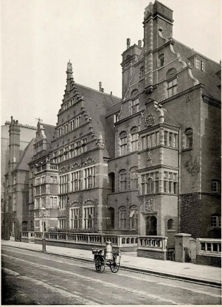
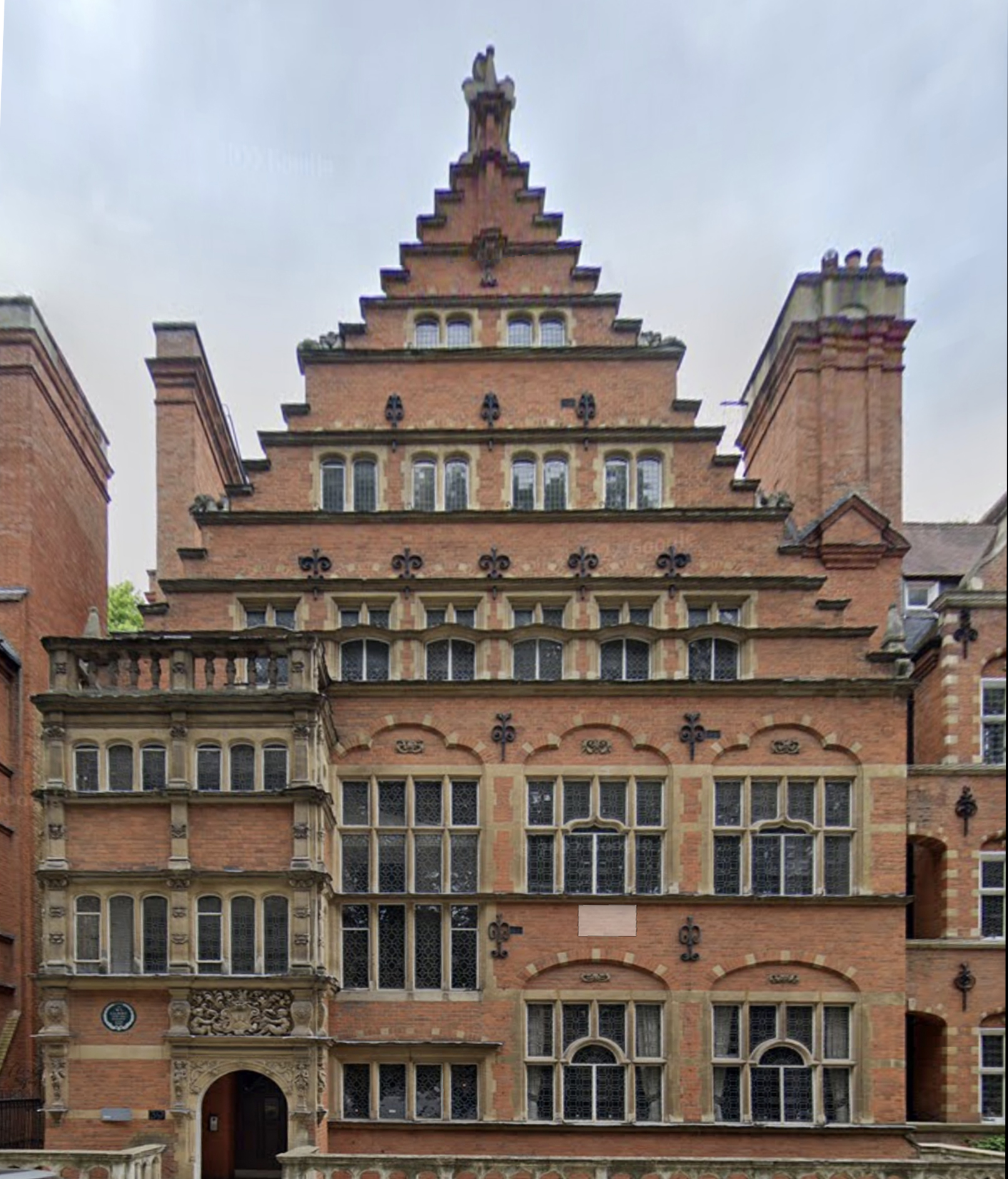
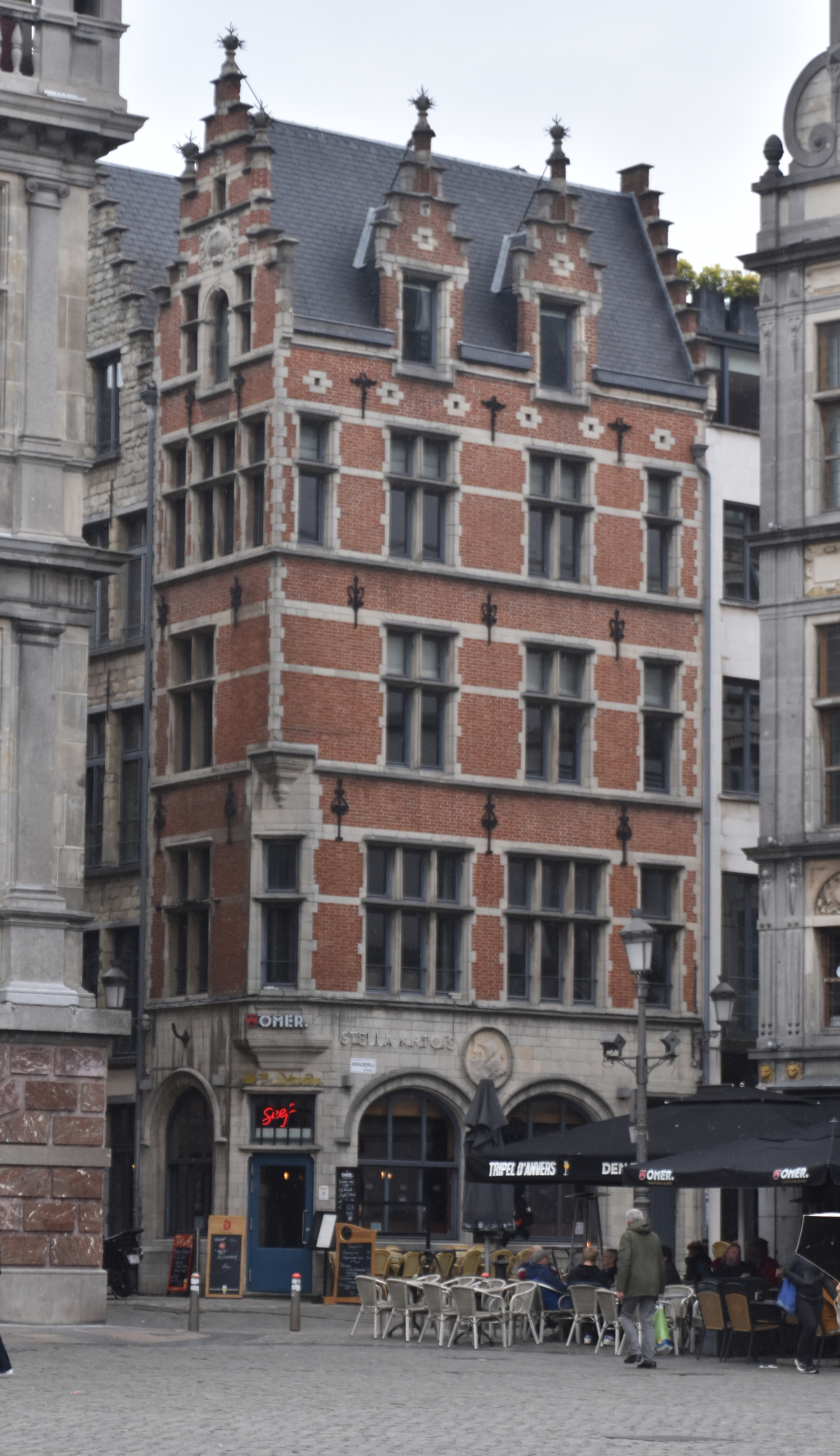
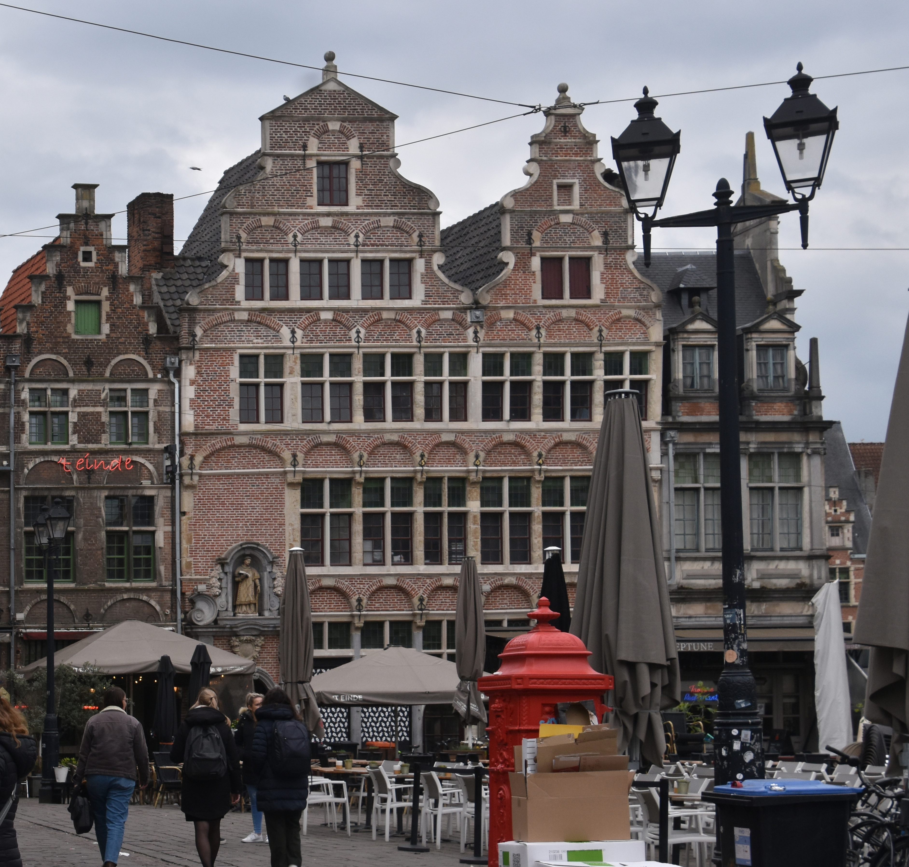
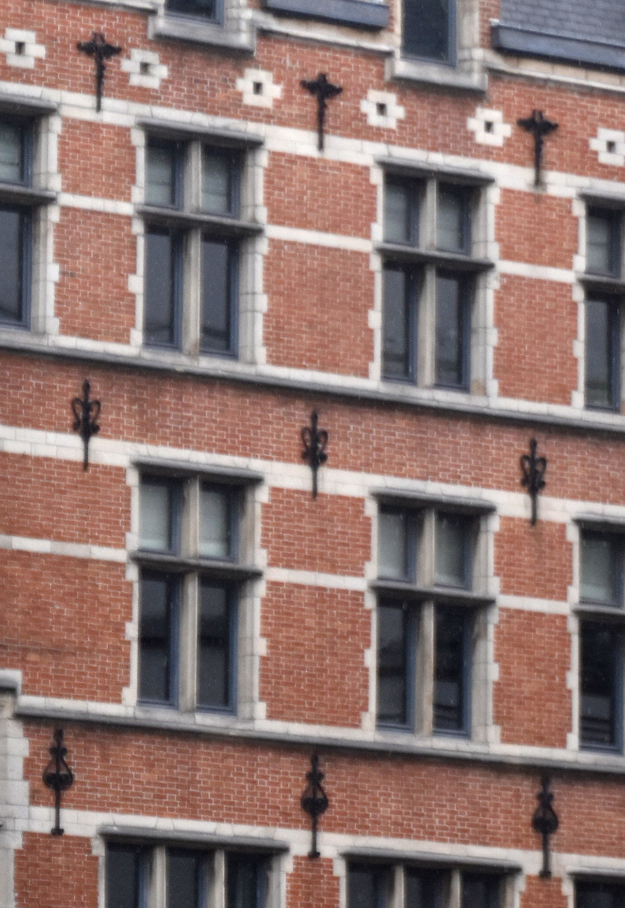
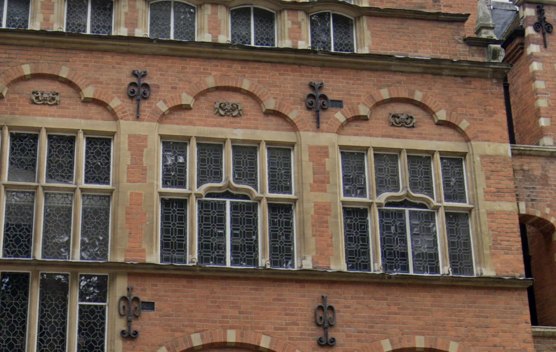
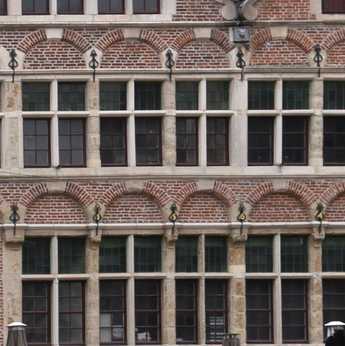
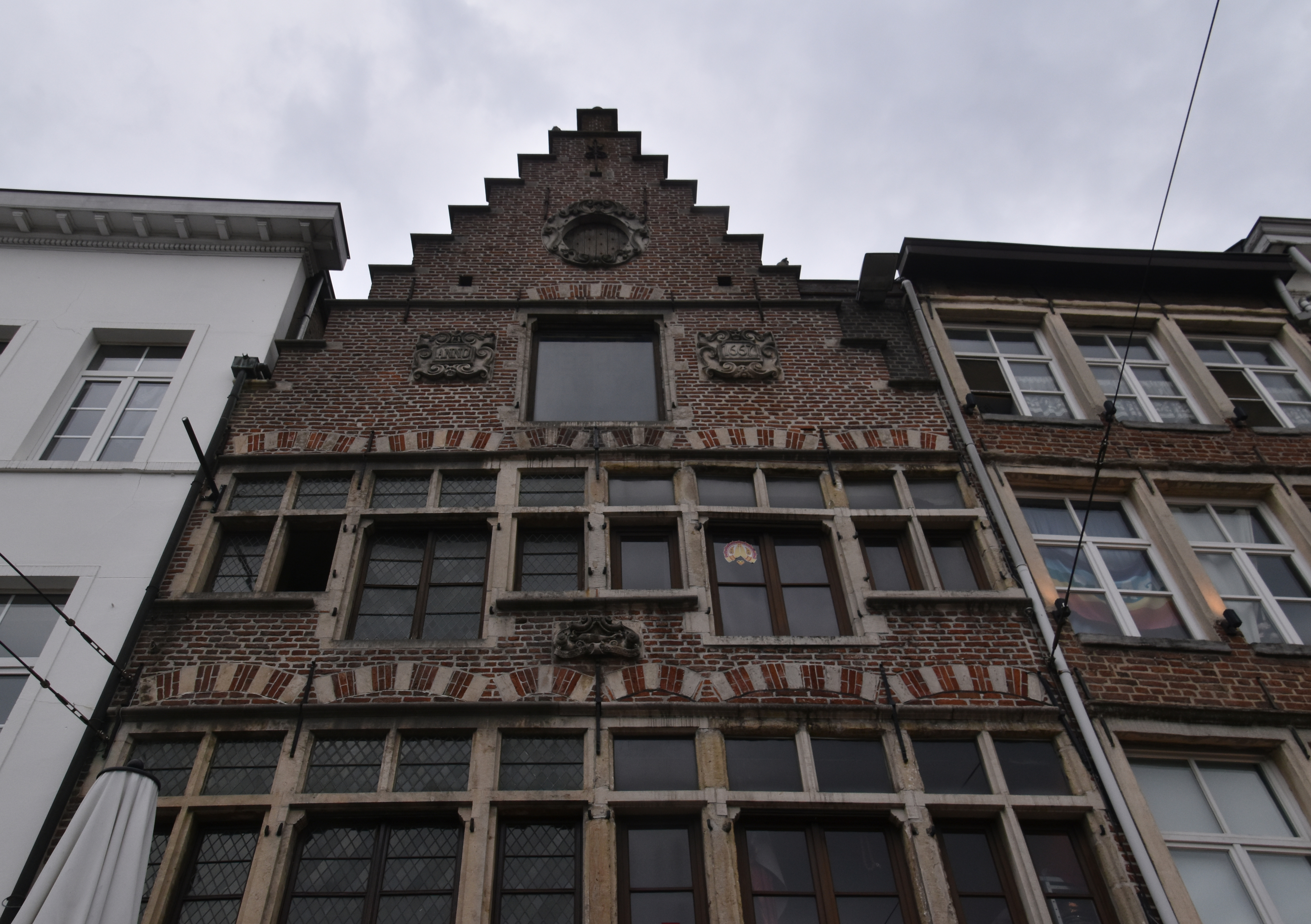
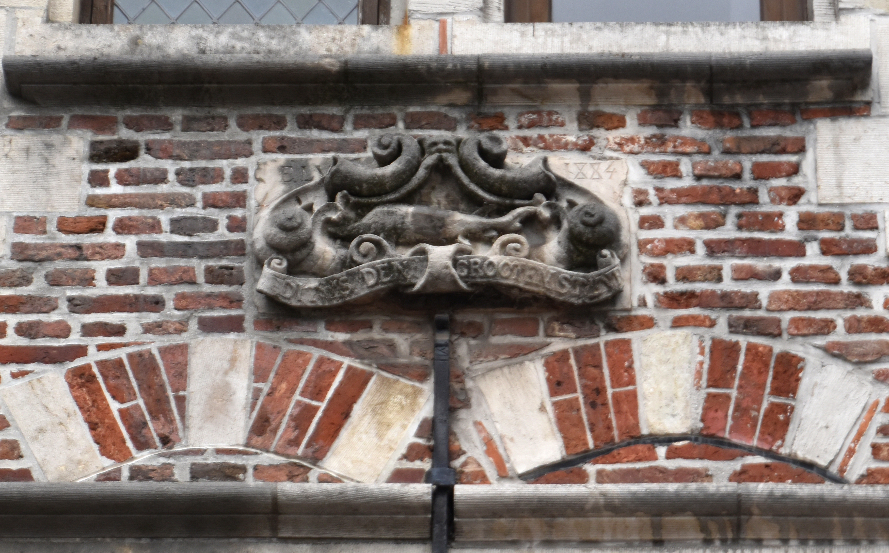

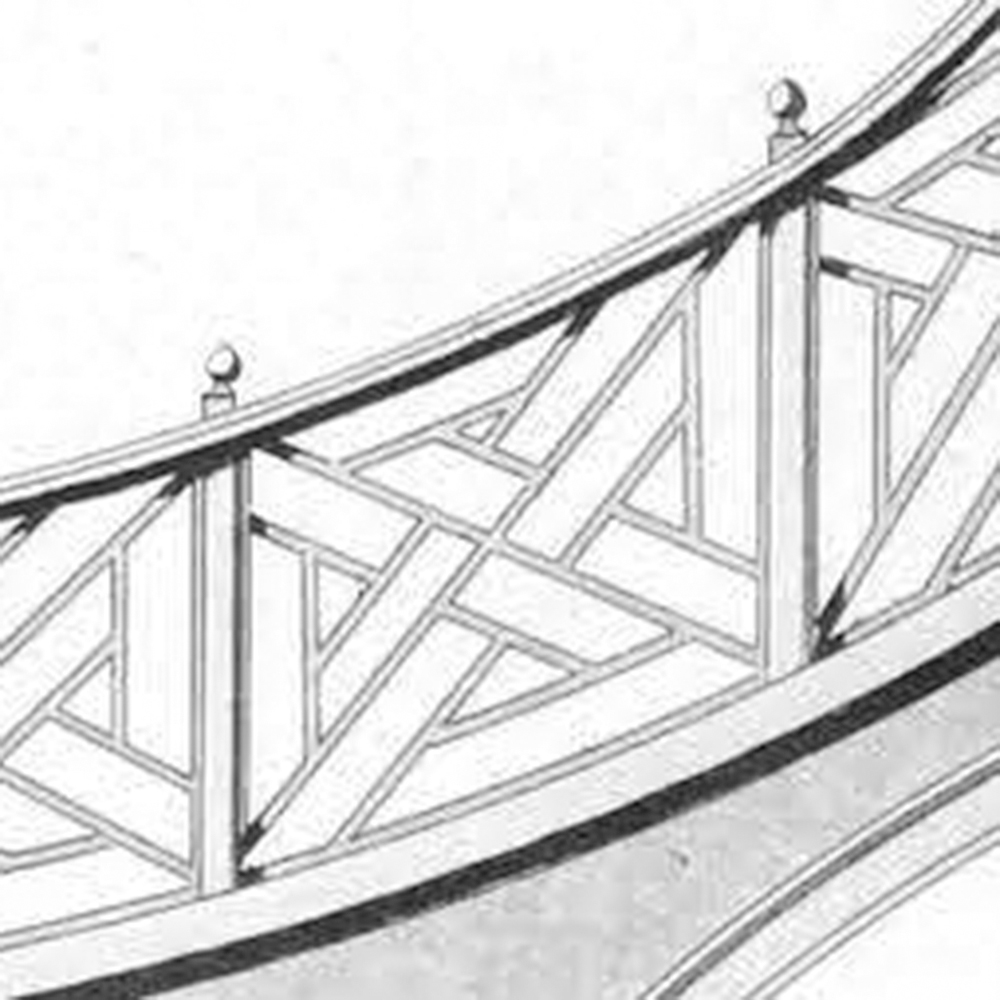
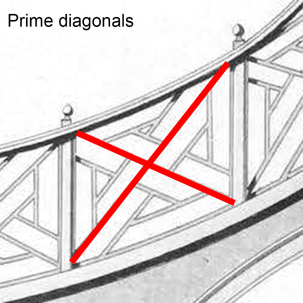
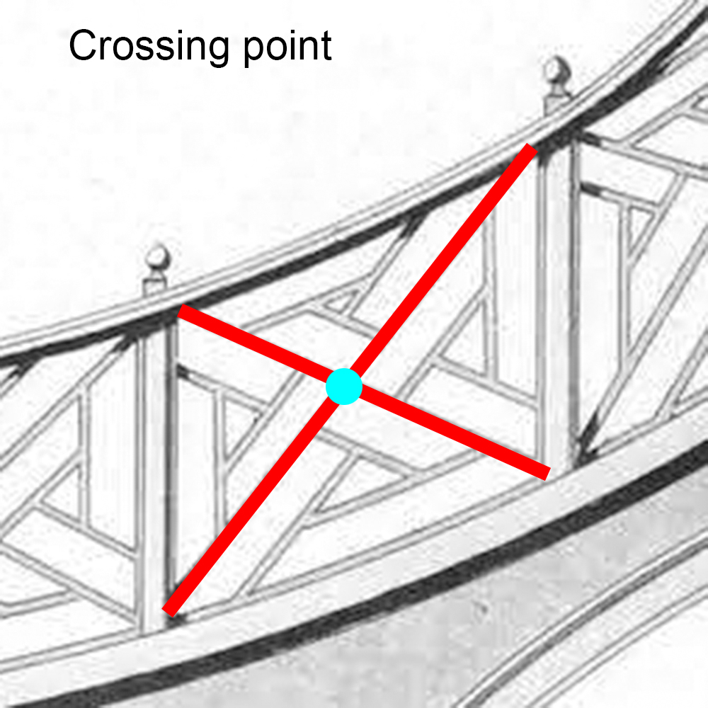
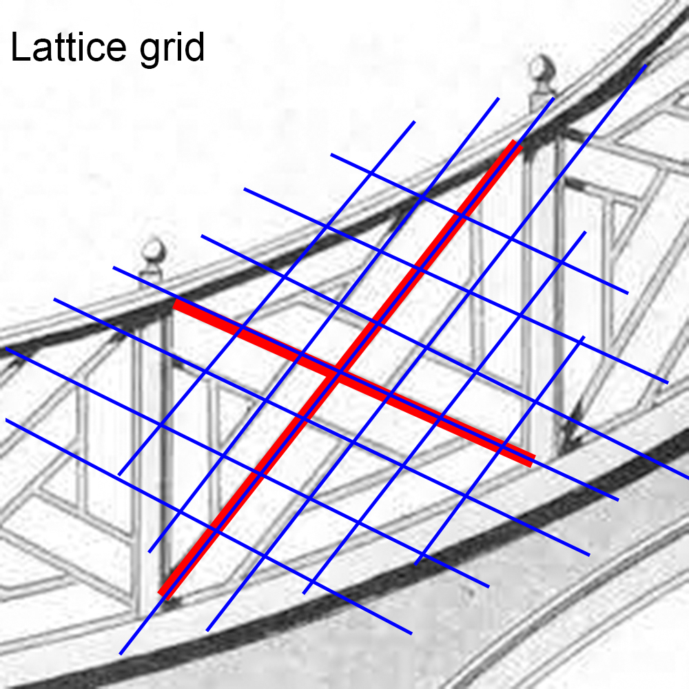

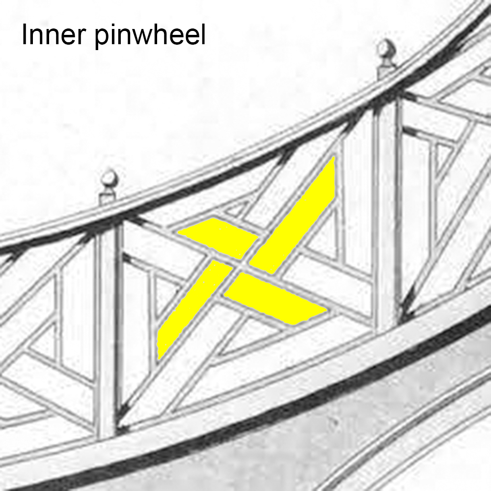
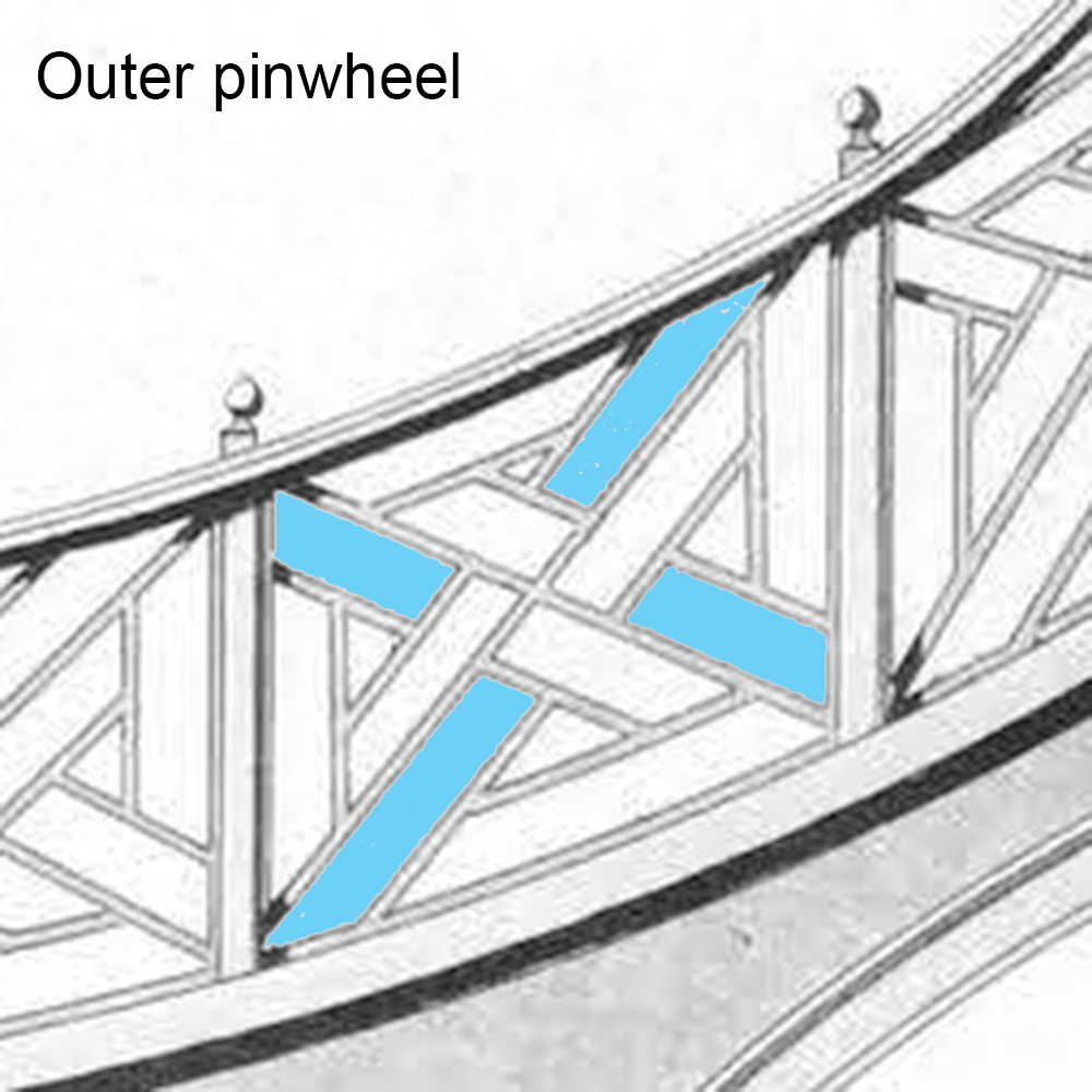

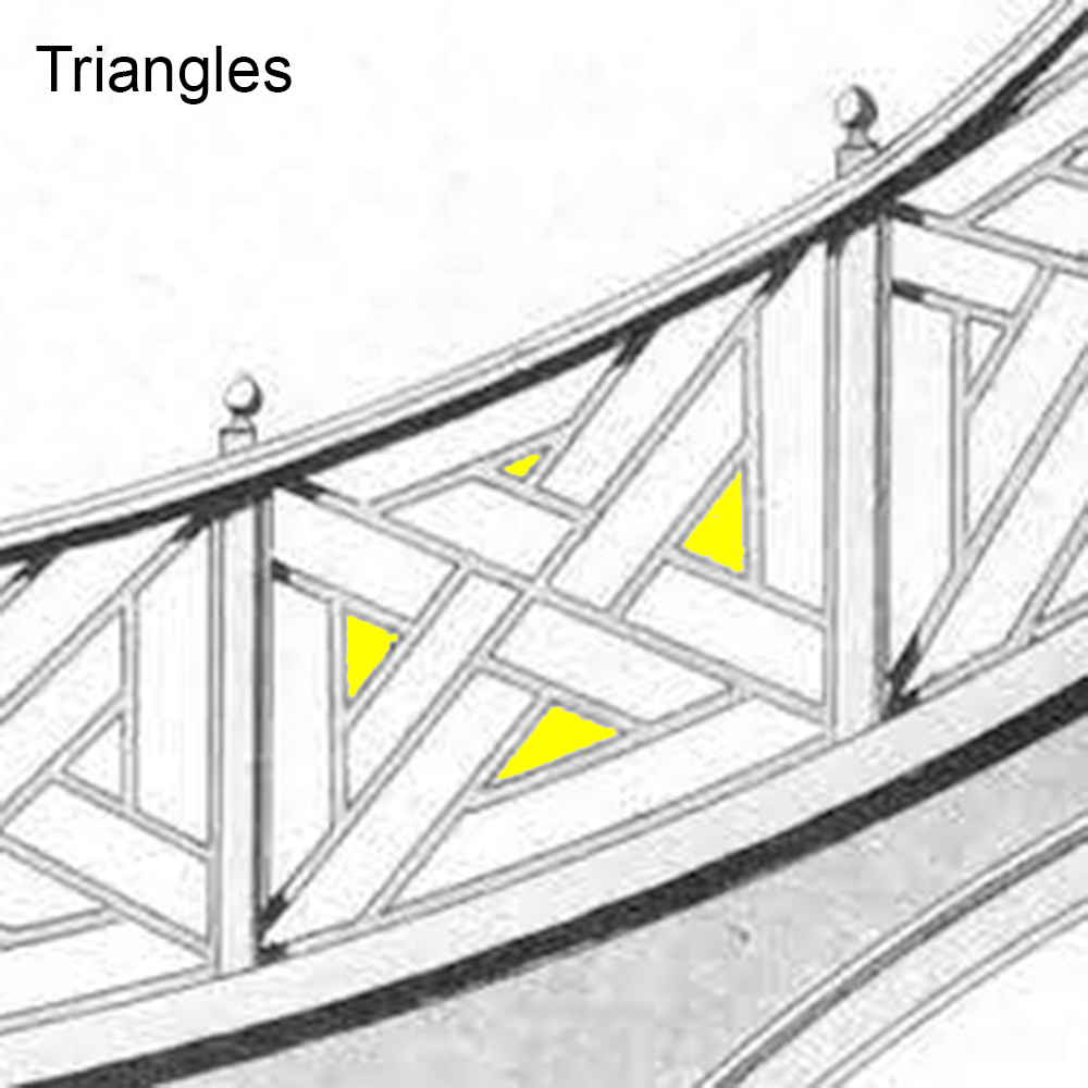
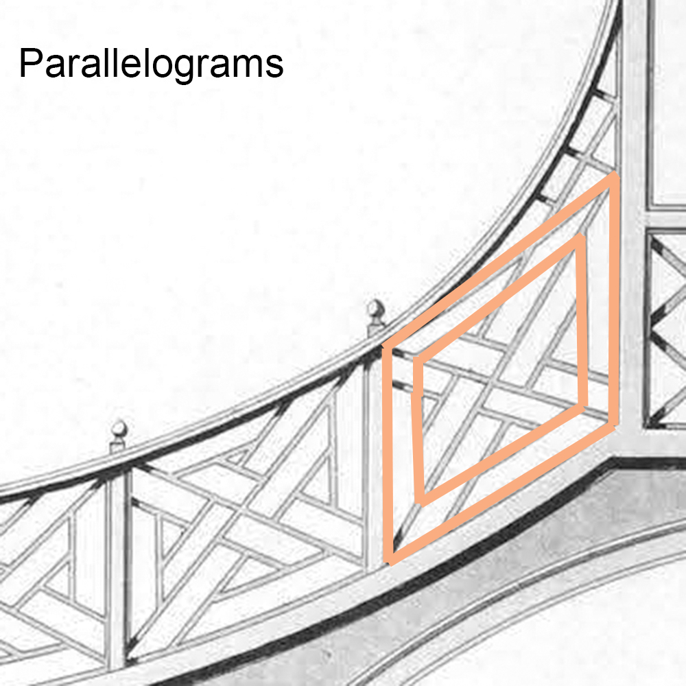
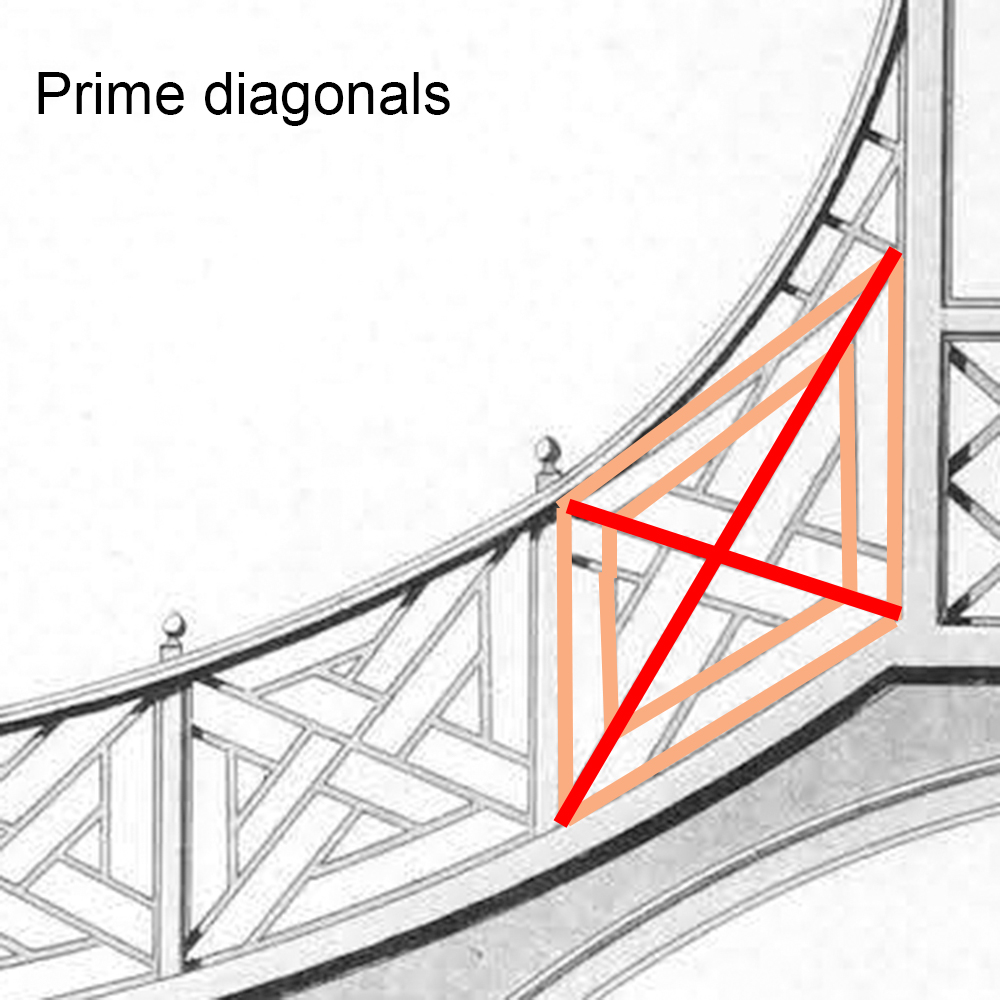
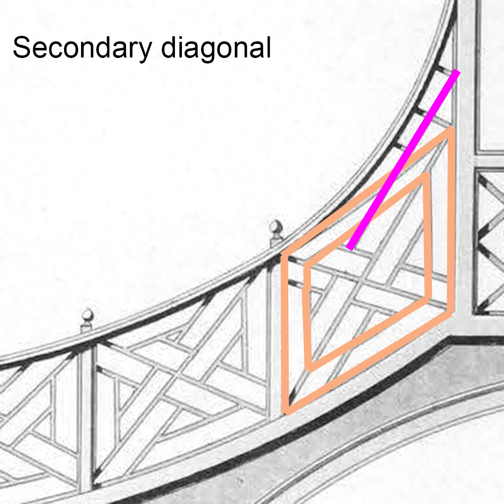

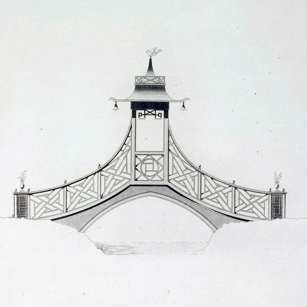


How a Rainbow Arch Declares the Death of Art History
Recently it was announced that Daylesford would get the Big Rainbow Arch. Hepburn Shire Council opened a survey asking for opinions on options for siting.[1]
Several current councillors make a lot of noise about consultation, and on issues like The Rex focus solely on ‘public consultation’ or the lack of it rather than on viable future action. But councillors are silent on the big question: whether this structure should be accepted at all. The council website states that ‘Daylesford has been selected as the home of the Big Rainbow by popular vote’, but this was not a popular vote of ratepayers of residents of the shire. Rather it was a vote of the LGBTQIA+ community organised by Tinder, the dating app.[2] Council then threw it support behind the project because ‘[w]e have a history of being strong supporters of our LGBTIQA+ residents and visitors.’ The use of the inclusive pronoun ‘we’ seems deliberately vague in its referent: is it Council or the Daylesford community?[3] One cannot oppose this proposal because to do so is to be anti LGBTQIA+, although a few brave souls have done so on social media, pointing out that to object to the structure does not necessarily mean objecting to what the structure stands for. But who believes this? Almost no-one. This is because art is now reduced to symbolism; it is the only dimension it now has. One cannot respond to the structure on aesthetic, art historical, or any other grounds other that what it stands for: support for the LGBTQIA+ community.
This is the inverse of destroying a beautiful eighteenth century portrait statue because one disapproves of the fact that its subject had a connection with slavery somewhere along the line. One has to accept the creation of something non-beautiful because what it is designed to symbolise is approved of.
It also represents the death of liberalism. An old fashioned liberal believed, like Edward VII, that you should be able to do what you like so long as it didn’t frighten the horses. But those who have benefited most from the liberal attitude are now dictatorial. The Taliban destroyed the Bamiyan Buddhas because in spite of being impressive creations that glorified humanity they stood for something they did not like, but, being opposed to imagery as such, they stopped short of installing a huge eyesore in its place. But here we are not opposed to imagery; far from it.
The trivialisation of contemporary art is to blame. Some of the most successful – in terms of being bought for large sums by art museum directors – pieces of contemporary art are predicated on a very simple, indeed simplistic idea: make a small thing big (and very bright and if possible shiny) and call it Art. Think giant milk crates or giant balloon dogs or giant mirrored Dresden statuettes. In the case of the rainbow arch, what was once as a flag in a window is given artistic significance by being made huge, gaudy and permanent.
There was a time that the sophisticated poured scorn on the uneducated vulgarity of the Queenslanders who created a Big Pineapple. (Hamilton in Victoria, or its termites, got rid of its Big Wool Bale some years ago, although Glenrowan still has its Big Ned Kelly.) But it would seem that there are few such sophisticates left. A new version of the ‘Big Pineapple’ was designed by a group of heavy-duty architectural firms.[4] ‘Big Things’ have been academicised and hence legitimised as ‘outdoor cultural objects which serve to construct and assert the identity of a town or area, and they have also been described as one of Australia’s most distinctive home-grown forms of folk art’.[5] To judge from the easy acceptance of the Big Rainbow on local social media, for millennials and Gen-Z, such big structures, as tourist destinations or objects in art museum foyers, are simply normal: they are Art.
But can one make an aesthetic case for the Big Rainbow? No. There is no design for the actual structure. There is only a concept, because that is all there is here. The form of the realisation of this concept is irrelevant, because form means nothing. Art history is predicated on the assumption that the fact that a statue represents Hercules is merely a given; what matters is what form that Hercules or Venus takes. From there the discourse begins – often along the lines that ‘this Hercules is modelled on the antique Farnese Hercules type … the Farnese Hercules was in such-and-such a place and accessible as a model to the artist, who changed things in such-and-such a way for such-and-such a purpose to such-and-such an effect.’ Or ‘this figure of Samson takes the form of an antique Hercules, the first instance of Renaissance classical revival …’. Hence the Big Rainbow asserts the death of Art History, and is the reason why one needs to assert, and keep asserting: ‘Non idea sed res’. Any fool can have an idea: culture resides in the form that that idea takes.
[1] https://participate.hepburn.vic.gov.au/big-rainbow#faqModal-3225-281-a
[2] From the Hepburn Shire website: ‘How was Daylesford selected as the new home of the Big Rainbow? After receiving thousands of submissions, Tinder worked in close collaboration with their panel of community advisors and experts within the LGBTQIA+ and First Nations communities to curate the shortlist of four nominated towns to possibly house the Big Rainbow. / From these four towns, the public then submitted over 16,000 votes to help find the leading town – making Daylesford the new home of the Big Rainbow. They also worked closely with Council to ensure there was an existing history of support for the LGBTQIA+ community and desire to be the home of the Big Rainbow. It’s important to ensure that the Big Rainbow is loved, respected and taken care of at its new home.’
[3] ‘From the Hepburn Shire website: ‘Why was Council keen to be involved in the Big Rainbow project? The Big Rainbow is Australia’s first BIG landmark celebrating regional LGBTQIA+ pride and inclusion, designed with members of the LGBTQIA+ and First Nations communities. We have a history of being strong supporters of our LGBTIQA+ residents and visitors.’
[4] Peddle Thorp and Harvey, Paul Luff, and Gary Smallcombe and Associates. https://www.bigpineapple.com.au/
[5] https://en.wikipedia.org/wiki/Big_Pineapple. ‘Big Things are large advertising objects, usually in the form of the item they are advertising, and are loosely defined as being at least twice the size of the object they represent and at least twice human size. Big Things have been called outdoor cultural objects which serve to construct and assert the identity of a town or area, and they have also been described as one of Australia’s most distinctive home-grown forms of folk art.’